| Author | Thread |
Comments Made During the Challenge  |
|
|
05/22/2007 07:20:05 AM |
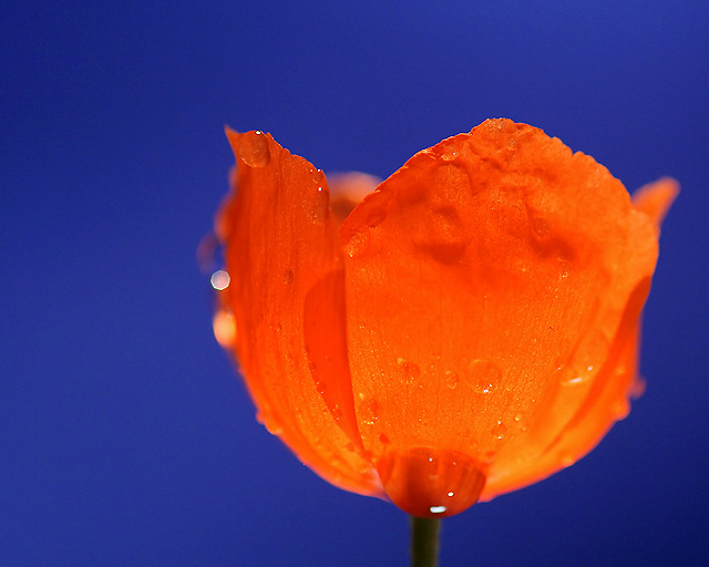
| Stunning colours. Very good effort. |
|
 Photographer found comment helpful. Photographer found comment helpful. |
|
|
05/21/2007 09:28:13 PM |
| I love the contrast between the orange and blue. |
|
| Photographer found comment helpful. |
|
|
05/19/2007 06:33:50 AM |
| good image, there are two/three reflections that are a bit distracting. 7 |
|
| Photographer found comment helpful. |
|
|
05/18/2007 09:24:55 PM |
| the colour contrast is superb. The close up is near perfect |
|
| Photographer found comment helpful. |
|
|
05/18/2007 12:09:21 PM |
| Looks like a soft petal. Good image. I like how the flower is not in the center of the photo. Very nice. |
|
| Photographer found comment helpful. |
|
|
05/18/2007 07:46:01 AM |
| Interesting color contrast. The color saturation of the bloom could be toned down just a notch. |
|
| Photographer found comment helpful. |
|
|
05/17/2007 09:08:56 PM |
| great color selection / lighting emphasis |
|
| Photographer found comment helpful. |
|
|
05/17/2007 07:57:37 PM |
|
| Photographer found comment helpful. |
|
|
05/17/2007 01:40:24 PM |
| A great concept but just not quite there. I think it would work better if the flower and water drops were all in focus. Beautiful color. |
|
| Photographer found comment helpful. |
|
|
05/17/2007 12:53:01 PM |
|
| Photographer found comment helpful. |
|
|
05/17/2007 11:21:29 AM |
| I love this image. The flower petals are like translusent I love the glowing look, and the soft water droplets. Great image, and i like how the background is just simple and blue. |
|
| Photographer found comment helpful. |
|
|
05/16/2007 12:55:17 PM |
|
| Photographer found comment helpful. |
|
|
05/16/2007 12:26:01 PM |
| I really like your contrast of colors |
|
| Photographer found comment helpful. |
|
|
05/16/2007 11:20:17 AM |
|
| Photographer found comment helpful. |
|
|
05/16/2007 10:12:45 AM |
| stunning colour, love that little light on the side, nice bokeh...great complementary colours 9 |
|
| Photographer found comment helpful. |
|
|
05/16/2007 07:17:40 AM |
| too much water, pull back on the macro so depth of field includes edges of flower giving the depth and highlighting smooth.warmer lighting and less saturation blue. A good colorful study. |
|
| Photographer found comment helpful. |
|
|
05/16/2007 07:08:15 AM |
| wow, love the bold bright colours, the orange works really well against the blue. If i was to change one thing I would try and get rid of the bright octagonal spot on the left as it is really distracting and ruins an otherwise great shot. |
|
| Photographer found comment helpful. |
|
|
05/16/2007 12:06:17 AM |
|
| Photographer found comment helpful. |
Home -
Challenges -
Community -
League -
Photos -
Cameras -
Lenses -
Learn -
Help -
Terms of Use -
Privacy -
Top ^
DPChallenge, and website content and design, Copyright © 2001-2025 Challenging Technologies, LLC.
All digital photo copyrights belong to the photographers and may not be used without permission.
Current Server Time: 03/11/2025 02:16:03 PM EDT.