| Author | Thread |
|
|
05/26/2007 12:09:21 PM |
Greetings from the Critique Club
I see you are fairly new to DPC and are settling in nicely. Terrific.
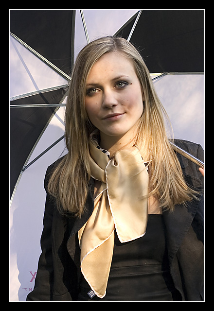
When I first saw this iamge, I thought, wow, what an attractive model and expressive eyes. Then I went to the umbrella and finally to the scarf, which was, I think the main focus of your composition. This image almost works. (If it was mine, I'd be happy!) Nevertheless, there were some minor problems that come to mind.
Yes, I also think the umbrella is a tad 'heavy' for the composition. But if used, perhaps the model doesn't need to be holding the handle. Then, there is a little red x at the lower left that might be better out of there. I'm gonna really nit pic and say the tag on the model's scarf should go away. And finally, there's something about the model's dress, especially around the waistline that gives the appearance of being wrinkled.
I'm really being nit picky about a really good image, because overall I think you have an excellent start here.
So, keep 'em coming and I wish you much luck in your future photography. You really are good at this. |
|
 Photographer found comment helpful. Photographer found comment helpful. |
Comments Made During the Challenge  |
|
|
05/22/2007 11:47:09 PM |
| I see the model's beautiful gaze first before the scarf. Maybe the focus has been inconveniently shifted here. Similar colours between her hair and the scarf don't really help the scarf as the main subject of silky-smooth to stand out either. But like I said, the model has a beautiful gaze and maybe this picture would better suit a category like that? Interesting lighting by the way :) |
|
| Photographer found comment helpful. |
|
|
05/22/2007 08:01:29 PM |
| I like the simple colors. very nice |
|
| Photographer found comment helpful. |
|
|
05/22/2007 07:00:46 AM |
| Nice but rather spoilt by the blotchy lighting on the face. |
|
| Photographer found comment helpful. |
|
|
05/21/2007 08:27:51 PM |
| Nice scarf - just lacks some wow factor. |
|
| Photographer found comment helpful. |
|
|
05/19/2007 11:15:09 PM |
| the composition in this one is great but the post processing seems way off to me. this would be a job for advanced editing so that you could get smoothness in her skin with arbrush and clone brush instead of all that neatimage and you could get rid of the logo on the umbrella and put a more even light on her face |
|
| Photographer found comment helpful. |
|
|
05/19/2007 07:34:14 AM |
| Nice idea but the harsh shadows on the face lower the rating for me. |
|
| Photographer found comment helpful. |
|
|
05/18/2007 09:51:41 PM |
|
|
|
05/18/2007 01:42:09 PM |
|
| Photographer found comment helpful. |
|
|
05/18/2007 12:29:20 PM |
|
|
|
05/18/2007 11:26:32 AM |
| Love the lighting! Good job! |
|
| Photographer found comment helpful. |
|
|
05/18/2007 08:22:58 AM |
| I like the model and the pose. The shadows on her face are a bit of a distraction. I'd also put more of her left hand into the frame. |
|
| Photographer found comment helpful. |
|
|
05/18/2007 04:30:15 AM |
| Nice picture but the shadow on her face is a little distracting |
|
| Photographer found comment helpful. |
|
|
05/17/2007 03:05:35 PM |
| that looks like one of the olson twins :) |
|
|
|
05/17/2007 02:58:14 PM |
| I dont like the shadows in her face |
|
| Photographer found comment helpful. |
|
|
05/16/2007 11:28:15 PM |
| Captured good emotion from subject, nice tones |
|
| Photographer found comment helpful. |
|
|
05/16/2007 12:24:27 PM |
| your lighting could use improvement around her face. |
|
| Photographer found comment helpful. |
|
|
05/16/2007 10:29:26 AM |
| the busy umbrella hurts this image ... |
|
| Photographer found comment helpful. |
Home -
Challenges -
Community -
League -
Photos -
Cameras -
Lenses -
Learn -
Help -
Terms of Use -
Privacy -
Top ^
DPChallenge, and website content and design, Copyright © 2001-2025 Challenging Technologies, LLC.
All digital photo copyrights belong to the photographers and may not be used without permission.
Current Server Time: 03/11/2025 01:46:24 PM EDT.