| Author | Thread |
|
|
05/23/2007 05:18:07 PM |
| Was just reading some of the comments and wanted you to know that there may be some (I for one) who like it as it is, grey border, crop, lighting and all ... e301 has a point abt the lack of intrigue or human interaction which might attract more interest, but then, it will be a different type of photo altogether. Congratulations! |
|
 Photographer found comment helpful. Photographer found comment helpful. |
|
|
05/23/2007 07:51:25 AM |
| 15th place!! Wow! That's pretty good for me. Thanks all! |
|
Comments Made During the Challenge  |
|
|
05/21/2007 03:22:24 PM |
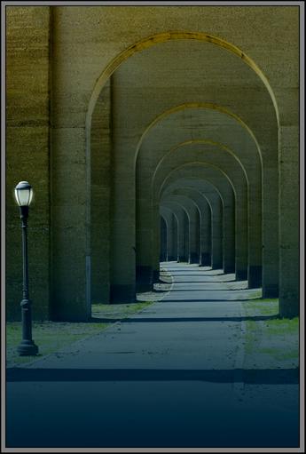
| a good and elegant framing |
|
| Photographer found comment helpful. |
|
|
05/21/2007 02:05:29 PM |
| I like the simplicity of this but I wish the colors weren't so washed out. The good lines and composition really help this great shot. |
|
| Photographer found comment helpful. |
|
|
05/20/2007 07:50:51 PM |
| Nice shot would have preferred the light post out |
|
| Photographer found comment helpful. |
|
|
05/20/2007 05:08:21 PM |
| Very interesting colors here. I also like how it fades from darkness to light. |
|
| Photographer found comment helpful. |
|
|
05/20/2007 12:52:17 AM |
| Seems a touch underexposed, and the gradient detracts from the picture to me... I love the concept, though. |
|
| Photographer found comment helpful. |
|
|
05/19/2007 01:35:13 PM |
| Lovely tones and pattern. Like it a lot - 8. |
|
| Photographer found comment helpful. |
|
|
05/19/2007 09:59:44 AM |
| Beautiful shot. I love the symmetry in this one. 7 |
|
| Photographer found comment helpful. |
|
|
05/18/2007 07:28:46 AM |
| very very interesting.good job |
|
| Photographer found comment helpful. |
|
|
05/18/2007 04:27:58 AM |
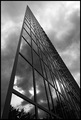
| Despite the slightly small size, I suspect you'll do quite well. Simplicity of composition works very well here. For me, it's a bit too obvious an entry for this - the lamppost giving just enough to balance the receding arches; but I find nothing here more than the recession and that post - no intrigue of composition, no human interaction. |
|
| Photographer found comment helpful. |
|
|
05/17/2007 07:43:59 PM |
Much potential here. Your cropping and composition is very nice although i think losing a little from the bottom would have strengthened your compostion. The shadows and repeating forms are special and the light is a perfect angular form to contrast with the curves. The image also seems to be lacking a touch of contrast IMHO.
I almost forgot... lose the grey border. :) |
|
| Photographer found comment helpful. |
|
|
05/17/2007 02:10:04 PM |
| love the gradient color change. the curve is just so satisfying! nice! |
|
| Photographer found comment helpful. |
|
|
05/17/2007 01:46:10 AM |
I like the colors and repetition but the gray border is not so flattering.
A little underexposed IMHO. |
|
| Photographer found comment helpful. |
|
|
05/16/2007 10:53:03 PM |
|
| Photographer found comment helpful. |
|
|
05/16/2007 08:59:59 PM |
| I would like to see this one in the top ten. You did a really good job here. |
|
| Photographer found comment helpful. |
|
|
05/16/2007 11:13:29 AM |
| a good idea, perhaps with one people before the corner was better. |
|
| Photographer found comment helpful. |
|
|
05/16/2007 07:39:22 AM |
| Very nice composition and lighting. |
|
| Photographer found comment helpful. |
|
|
05/16/2007 12:10:08 AM |
|
| Photographer found comment helpful. |
Home -
Challenges -
Community -
League -
Photos -
Cameras -
Lenses -
Learn -
Help -
Terms of Use -
Privacy -
Top ^
DPChallenge, and website content and design, Copyright © 2001-2025 Challenging Technologies, LLC.
All digital photo copyrights belong to the photographers and may not be used without permission.
Current Server Time: 04/02/2025 06:43:15 AM EDT.