| Author | Thread |
|
|
05/31/2007 05:13:23 AM |
Hi from the Critique Club
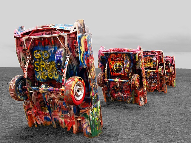
Fit: Almost any picture will fit this challenge but the question is does the image benefit from the treatment. Your image fits but lets see if I think it benefits...
Composition: Composition is ok but there are areas for improvement. One of the "rules" (I say that in quotes because rules are never fixed in stone) is that horizon should be level. In this case it should. You have a nice sight line formed by the cars as they recede into the distance but the titled horizon competes for our attention as it slopes down to the right.
Technical: This image is one that is fitting for the selective desaturation. There are some aspects that mean that this has not been realised to the potential ot could have been. First, outside of the colour areas we have no intest. This means that while you have the cars in colour, that is all we see in the image to it almost feels as if nothing has been desaturatd. Secondly, the sky is blown out a bit. More detail in the sky would have aided the above point but also not given us that bright area at the top that we can't help but be drawn to. Do you shoot in RAW? If so then maybe it's time to think about HDR and Tone Mapping. Do you have photoshop CS2? If so then the Shadow/Hilights tool may have brought some detail out in the sky. I also wonder if this isn't overexposed a litte.
Feel: I didn't vote in this challenge but I do like this image. The subject is unique (that is getting harder and harder on DPC). The colours are vivid. The image has interest. It's just that once my eye has run along the line of cars I feel like there should be more but that is all there is. I think this would have easily passed a score of 6 if there was more detail outside of the cars.
PM me if you have any queries and good luck in future challenges. |
|
 Photographer found comment helpful. Photographer found comment helpful. |
Comments Made During the Challenge  |
|
|
05/26/2007 05:00:50 AM |
| i really wish this was a one car shot......8 |
|
| Photographer found comment helpful. |
|
|
05/25/2007 07:26:41 PM |
| very nice composition, and nice editing. |
|
| Photographer found comment helpful. |
|
|
05/24/2007 03:38:31 AM |
| Has a surreal aspect to it, like it was shot on the moon. I hate that they've painted over all of them, in a way. I seem to recall seeing shots when they still looked like cars instead of multicolored alien invaders. |
|
| Photographer found comment helpful. |
|
|
05/23/2007 07:53:21 PM |
| That's wierd I was thinking that it would be awsome to go down and take this same shot. I've been there before on my wat to Oceanside from kc. 10 |
|
| Photographer found comment helpful. |
|
|
05/22/2007 07:17:14 PM |
| Looks like we have a winner....you recieve a 10. |
|
| Photographer found comment helpful. |
|
|
05/21/2007 09:22:48 PM |
| Awesomely surrealistic, and the desat makes it more so. Great pic. |
|
| Photographer found comment helpful. |
|
|
05/21/2007 02:45:58 PM |
| aside from the fact that the subject of the photo is awesome....the colors are incredible, and the composition of the picture itself is great! |
|
| Photographer found comment helpful. |
|
|
05/21/2007 11:31:03 AM |
| I've seen these before, I think they are Awesome. You did a wonderful job with these. |
|
| Photographer found comment helpful. |
|
|
05/21/2007 12:30:49 AM |
| Hah! I photographed this installation for the artists when it first went in the ground! Lawd, it's been graffitied up, hasn't it? Nice shot! |
|
| Photographer found comment helpful. |
Home -
Challenges -
Community -
League -
Photos -
Cameras -
Lenses -
Learn -
Help -
Terms of Use -
Privacy -
Top ^
DPChallenge, and website content and design, Copyright © 2001-2025 Challenging Technologies, LLC.
All digital photo copyrights belong to the photographers and may not be used without permission.
Current Server Time: 03/12/2025 08:05:10 AM EDT.