| Author | Thread |
Comments Made During the Challenge  |
|
|
05/29/2007 06:01:53 PM |
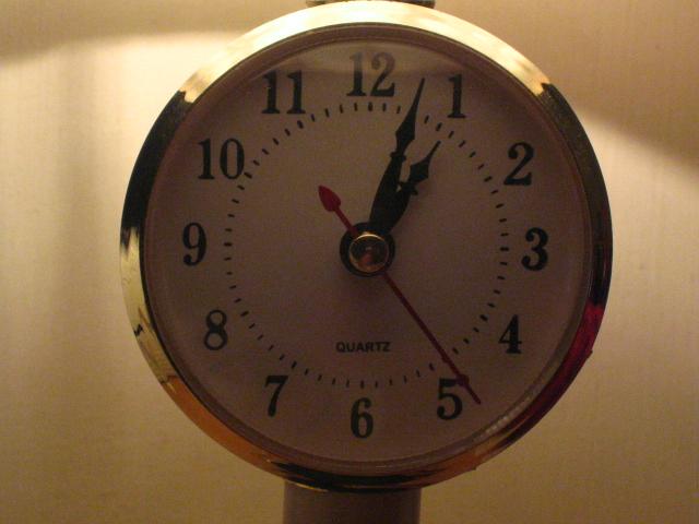
it doesn't appear to be vertical and I'm not too fond of the crop
5
Jack |
|
|
|
05/29/2007 03:25:38 PM |
| Needs more interesting lighting and sharper focus. |
|
|
|
05/27/2007 02:29:13 AM |
| Noisy and underexposed IMO Very Grainy in the face of the clock. Better lighting would have improved this image a bit. Better positioning would also improve the overall quality. At present it sits high and right of centre, with no apparent need. Good Luck |
|
|
|
05/25/2007 08:28:31 PM |
| Picture looks a bit grainy. It is disturbing that the brightest part of your picture is the non-descript background while the focal point of your shot - the watch face languishes in shadow. Nice focus. Framing could have been better (center top-bottom, left-right for this shot). The reflection at the top of the bezel also distracts from the photo. I like the idea, but think these things robbed you of a great shot. |
|
|
|
05/25/2007 10:26:44 AM |
| Your subject is a bit confusing, probably because of the dim lighting. Is it the shape of the clock or what the hands are reading on the face? From the standpoint of the shapes theme, the clock is not very interesting. |
|
|
|
05/25/2007 09:05:19 AM |
| quite noisy ... slightly tilted to the right ... lighting isn't helping your image ... |
|
|
|
05/23/2007 08:57:35 AM |
| the focus and lighting need some help on this issue - it appears to have been underexposed and then brightened to show more detail - but the result is a pixelated image - 3 |
|
Home -
Challenges -
Community -
League -
Photos -
Cameras -
Lenses -
Learn -
Help -
Terms of Use -
Privacy -
Top ^
DPChallenge, and website content and design, Copyright © 2001-2025 Challenging Technologies, LLC.
All digital photo copyrights belong to the photographers and may not be used without permission.
Current Server Time: 12/14/2025 07:22:30 PM EST.