| Author | Thread |
|
|
06/01/2007 05:44:38 AM |
Greetings from the Critique Club.
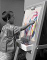
Composition: I like the layout here....the selective colour makes the subject come right out.
Technical: Focus is good. The blown out area on the top right is distracting and may have cost you points.
Overall: I know this is a wild subject...and the voters may have felt the cluttered area was the problem. Maybe try a lower down and closer angle...! |
|
 Photographer found comment helpful. Photographer found comment helpful. |
Comments Made During the Challenge  |
|
|
05/22/2007 01:37:16 PM |
| The contrast on this seems a bit harsh... borderline overexposed |
|
| Photographer found comment helpful. |
|
|
05/22/2007 12:44:41 PM |
|
| Photographer found comment helpful. |
|
|
05/21/2007 11:01:57 PM |
|
| Photographer found comment helpful. |
|
|
05/21/2007 05:46:00 PM |
| Nice image, but would be beautiful a little darker. |
|
| Photographer found comment helpful. |
|
|
05/21/2007 09:42:54 AM |
| Those colours are magnificent against a mono background, it works well |
|
| Photographer found comment helpful. |
Home -
Challenges -
Community -
League -
Photos -
Cameras -
Lenses -
Learn -
Help -
Terms of Use -
Privacy -
Top ^
DPChallenge, and website content and design, Copyright © 2001-2025 Challenging Technologies, LLC.
All digital photo copyrights belong to the photographers and may not be used without permission.
Current Server Time: 03/12/2025 01:24:21 AM EDT.