| Author | Thread |
|
|
05/28/2007 12:16:20 AM |
| I like the high contrast :-) |
|
 Photographer found comment helpful. Photographer found comment helpful. |
Comments Made During the Challenge  |
|
|
05/23/2007 07:21:21 PM |
| Doese not really intrest me. Sorry |
|
|
|
05/23/2007 03:41:52 PM |
| I love the this shot, it is very clear. This is a good sharp pic. Excellent work. |
|
| Photographer found comment helpful. |
|
|
05/22/2007 05:10:32 PM |
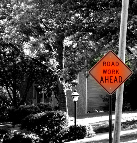
| Did you intend for the corners of the sign to fade to gray? |
|
| Photographer found comment helpful. |
|
|
05/22/2007 12:55:50 PM |
I wish I could have commented on this before voting began. Forgive me if I go to far. I'm pointing things out for you to learn from not to be mean.
1) What is the story you are trying to convey here? For me, the image is a bit boring.
2) The sign is weirdly faded at it's corners. I find it a bit disturbing since I don't know if it's naturally this way or if it was through processing.
3) The contrast of the background is so great that you've lost details in the shadows and in the highlights.
4) The crooked pole behind the sign draws my eyes away from the sign.
Hope I wasn't too hard. I know it's only your second challenge, but I know you probably have gotten many help comments yet either. Hang in there. |
|
| Photographer found comment helpful. |
|
|
05/22/2007 10:23:22 AM |
| Might have been good to show the road work. This doesn't do much for me. Sorry. |
|
| Photographer found comment helpful. |
Home -
Challenges -
Community -
League -
Photos -
Cameras -
Lenses -
Learn -
Help -
Terms of Use -
Privacy -
Top ^
DPChallenge, and website content and design, Copyright © 2001-2025 Challenging Technologies, LLC.
All digital photo copyrights belong to the photographers and may not be used without permission.
Current Server Time: 04/26/2025 02:56:23 PM EDT.