| Author | Thread |
|
|
12/31/2003 09:59:12 AM |
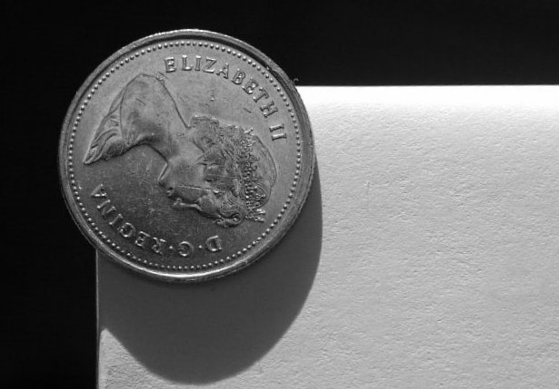
3 - 10's and 3 - 1's..interesting! I knew the shadow wouldn't go over well, but it was natural because of the round edge that wrapping the paper over the shelf created...I tried a few times to get rid of it, oh well. :-)
Message edited by author 2005-02-17 12:58:09. |
|
Comments Made During the Challenge  |
|
|
12/30/2003 08:16:18 PM |
This could be a really cool shot if it wasn\'t for the horrible shadow (fill lighting needed) and if it was rotated 180 degrees.
TC |
|
 Photographer found comment helpful. Photographer found comment helpful. |
|
|
12/30/2003 06:02:21 PM |
| Nice image ...could have been so much better if the Queen's head was on straight :) nice contrast as well |
|
|
|
12/30/2003 04:04:28 PM |
|
|
|
12/30/2003 04:46:32 AM |
To be honest, the image does not give me an edge-felling. My first thoughts were: a coin on a white paper that is palced on a black paper.
A different angle, maybe from below might have been better. I do like the texture in the white part: makes the image more 3D. |
|
|
|
12/28/2003 07:09:19 AM |
|
|
|
12/27/2003 03:02:55 PM |
|
|
|
12/26/2003 08:54:36 AM |
|
|
|
12/26/2003 08:03:53 AM |
| Well focused. Clean and simple. |
|
|
|
12/26/2003 03:07:44 AM |
| someone else with a canadian coin...i like it :) the shadow is a little odd...harsh or something. i newer nickle would have been easier to light...less funny shadows etc. nice pic. Pedro |
|
|
|
12/24/2003 10:31:39 AM |
| A photo should be interesting, and this isn't. |
|
|
|
12/24/2003 06:14:52 AM |
Really works in B/W.
Good shot |
|
Home -
Challenges -
Community -
League -
Photos -
Cameras -
Lenses -
Learn -
Help -
Terms of Use -
Privacy -
Top ^
DPChallenge, and website content and design, Copyright © 2001-2025 Challenging Technologies, LLC.
All digital photo copyrights belong to the photographers and may not be used without permission.
Current Server Time: 03/14/2025 06:01:23 AM EDT.