| Author | Thread |
Comments Made During the Challenge  |
|
|
12/30/2003 08:24:01 PM |
This has got to be in the top 5! Love the simplicity. Love the lighting and tonality too! Kudos!
TC |
|
 Photographer found comment helpful. Photographer found comment helpful. |
|
|
12/30/2003 09:23:13 AM |
| I love the bland uniformity and the shapes. |
|
| Photographer found comment helpful. |
|
|
12/29/2003 10:50:22 AM |
|
| Photographer found comment helpful. |
|
|
12/29/2003 07:02:15 AM |
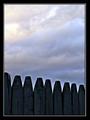
| Almost, almost ... my questions would be: cropping - why so much negative space (or alternatively, why so little)? Why so little contrast range ... I understand what your title implies, but would a touch more light and shade really hurt it so much? the curves and planes of these objects ought to allow for a wonderful range of shade, and I think you've bleached that out of it a little with the lighting. |
|
| Photographer found comment helpful. |
|
|
12/28/2003 10:32:38 PM |
| I really liked your image. The suttle details and contrast variations are nice. And I especially like the composition. Well taken. |
|
| Photographer found comment helpful. |
|
|
12/26/2003 01:23:27 PM |
|
| Photographer found comment helpful. |
|
|
12/24/2003 08:02:02 AM |
| this is absolutely flawless... 10. |
|
| Photographer found comment helpful. |
|
|
12/24/2003 07:07:10 AM |
| Very nice monochromatic shot. Great composition! |
|
| Photographer found comment helpful. |
|
|
12/24/2003 12:10:51 AM |
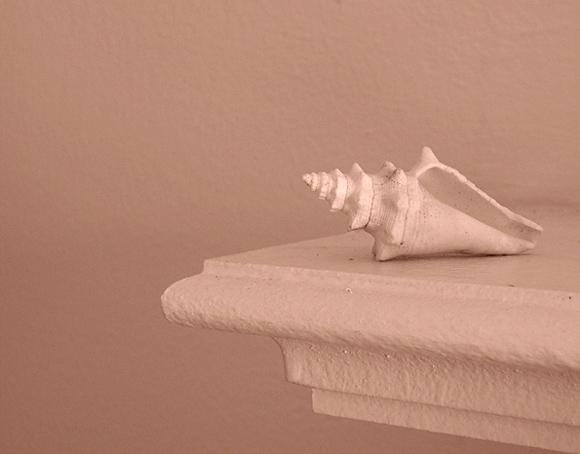
| I like the monotonous feeling of this image... nice use of 'lack of color' :) |
|
| Photographer found comment helpful. |
Home -
Challenges -
Community -
League -
Photos -
Cameras -
Lenses -
Learn -
Help -
Terms of Use -
Privacy -
Top ^
DPChallenge, and website content and design, Copyright © 2001-2025 Challenging Technologies, LLC.
All digital photo copyrights belong to the photographers and may not be used without permission.
Current Server Time: 03/13/2025 07:04:17 AM EDT.