| Author | Thread |
|
|
01/07/2004 10:25:26 AM |
Greetings from the Critique Club!
This is a great idea. The composition (centered) is perfect for this type of poster. Your idea matches well with your text, and your flash has obviously done it's job well, as the lighting and exposure are nice.
Honestly, I agree with some of the comment below about the arrows. I admit that it is nice to have something there to break up the plain composition, but the arrows confuse me. Why are they there? Why do they curve the way they do, and why do they point backwords? Why does one of them cover up the runner's hand? (By the way - his hands are not in correct position for the starting of a race.)
Overall, this is a strong image and a strong quote.
Steve |
|
|
|
01/05/2004 02:31:57 PM |
| This is really under rated IMHO. The lighting is just wonderful.... |
|
Comments Made During the Challenge  |
|
|
01/03/2004 03:41:57 AM |
| If the arrow was more a part of the floor, not overlapping his hand, better. His dar face needs a little more lightening. |
|
|
|
01/02/2004 11:47:13 AM |
| Good pose and expression, and the low key approach works well with the poster's theme. I don't know that the runner is in pain yet, but the idea comes across anyway. The orange arrow adds a nice touch of color, but the way it crosses the model's hand and wrist is rather distracting. |
|
|
|
01/02/2004 05:45:22 AM |
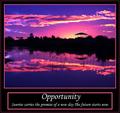
| This has be validated but I don't know how you can put his arrows there with out being illegal. But great photot, would be better without the reflection. -9 |
|
|
|
01/01/2004 08:09:03 PM |
| The orange arrow would look better if the hand was on top of it. |
|
|
|
01/01/2004 05:55:39 PM |
| Well executed shot. Good quote too. |
|
|
|
12/30/2003 06:55:31 PM |
| Image a little dark for my preferences but fits the message very well indeed and the eye contact makes it striking. |
|
|
|
12/30/2003 03:00:39 PM |
| You got a great look of intensity on the runner's face. I'm not sure what you meant the arrows to symbolize; they seem to be there for a reason. |
|
|
|
12/30/2003 02:55:56 AM |
| The quote doesn't match the subject's pose -- he's just starting a race and isn't experiencing any pain yet. Plus I don't get why the arrows are there, and why they're pointing "backwards." |
|
|
|
12/29/2003 09:55:16 PM |
| NIce photo, but I think it would have been more "motivational" if you showed the runner running, maybe at the end and showing the pain |
|
|
|
12/29/2003 02:20:16 PM |
|
|
|
12/29/2003 02:14:54 PM |
| Nice image, though I don't quite get the arrows. It really needs to have the title as the dominant piece of text, as it is it just doesn't have immediate impact. |
|
|
|
12/29/2003 11:56:44 AM |
| I like the poster - but be careful on your spelling - poster's right, title is an oops! |
|
|
|
12/29/2003 10:17:53 AM |
|
|
|
12/29/2003 08:58:46 AM |
| In my view the text really needs an image which shows someone close to his limits, with an expression of pain, intense effort, persistence. This guy is still too relaxed. |
|
|
|
12/29/2003 05:18:33 AM |
| Amazing shot of the man. Love the reflection and the arrows add a nice touch. But the text is too overpowering for the image. |
|
Home -
Challenges -
Community -
League -
Photos -
Cameras -
Lenses -
Learn -
Help -
Terms of Use -
Privacy -
Top ^
DPChallenge, and website content and design, Copyright © 2001-2025 Challenging Technologies, LLC.
All digital photo copyrights belong to the photographers and may not be used without permission.
Current Server Time: 03/12/2025 07:53:08 PM EDT.