| Author | Thread |
Comments Made During the Challenge  |
|
|
12/30/2003 09:00:56 AM |
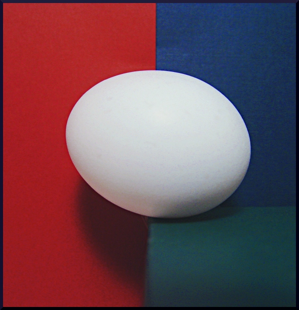
| the egg shadowand its own shadow muddy the colors at the lower part of the image |
|
 Photographer found comment helpful. Photographer found comment helpful. |
|
|
12/28/2003 06:32:32 AM |
| This picture complements the title. Would have rated higher however, a tad bit noisy |
|
| Photographer found comment helpful. |
|
|
12/28/2003 04:29:00 AM |
| I strangely see a discontinuity on the upper quater of the egg, could be my monitor though. |
|
| Photographer found comment helpful. |
|
|
12/27/2003 10:53:22 PM |
| nice clean lines and I like the use of the bold colors. For some reason I would have gone with only 2 colors for the "edge" theme but I love it |
|
| Photographer found comment helpful. |
|
|
12/27/2003 07:49:28 PM |
| Nicely done; I think it would be better without the noise in the pure colors. Also, the grreen areas is almost unnoticeable. |
|
| Photographer found comment helpful. |
|
|
12/27/2003 05:19:51 AM |
While I like the idea of this image, I have to say that its been rather poor executed: these kind of abstract images have to be on a very high quality to work well here and get high votes. So jpeg-artifacts must be avoided and the light has to be set very well.
It took me some time to realize that the egg is at an edge: the background-color and the table color are to simillar. |
|
|
|
12/26/2003 07:02:30 PM |
| Very nice composition, but I would use a single blue, instead of blue/cyan. Voted 8 |
|
| Photographer found comment helpful. |
|
|
12/26/2003 08:23:02 AM |
| Good idea. Colors seem oversaturated and the picture appears slightly slanted. |
|
| Photographer found comment helpful. |
|
|
12/24/2003 05:11:34 PM |
| the title to me is very .. vague or misleading... but at least its not titled: on the edge... like about 50 other posts :-p |
|
| Photographer found comment helpful. |
|
|
12/24/2003 02:50:17 PM |
| Nice, simple concept & composition. It's a little dark though. |
|
| Photographer found comment helpful. |
|
|
12/24/2003 12:30:42 PM |
| lots of colour noise and shadaws, which makes me think you could have lit this differently (perhaps bouncing light with a little reflector or some paper to fill in the shadows). crisp focus and nice concept though. Pedro |
|
| Photographer found comment helpful. |
|
|
12/24/2003 01:20:33 AM |
| the green section on the bottom is distracting |
|
| Photographer found comment helpful. |
Home -
Challenges -
Community -
League -
Photos -
Cameras -
Lenses -
Learn -
Help -
Terms of Use -
Privacy -
Top ^
DPChallenge, and website content and design, Copyright © 2001-2025 Challenging Technologies, LLC.
All digital photo copyrights belong to the photographers and may not be used without permission.
Current Server Time: 03/13/2025 05:26:52 AM EDT.