| Author | Thread |
Comments Made During the Challenge  |
|
|
12/30/2003 09:22:43 AM |
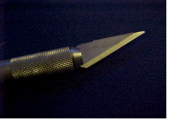
| unfortunately, there is too much digital noise in this photo and it distracts. nice attempt |
|
 Photographer found comment helpful. Photographer found comment helpful. |
|
|
12/29/2003 01:02:56 PM |
| bad quality and the thik white line is ugly -1 |
|
| Photographer found comment helpful. |
|
|
12/29/2003 07:49:48 AM |
| A bit to grainy for my tastes |
|
| Photographer found comment helpful. |
|
|
12/29/2003 12:44:41 AM |
| Nice concept, but the photo is noisy and it could have used better lighting. |
|
| Photographer found comment helpful. |
|
|
12/28/2003 08:44:53 PM |
| Nice image, 2 thoughts. 1. turn the blade so it gets a little more highlight to the edge. 2. place the tip of the blade on the border of the photo, so it looks like the blade is cutting the border. nice effort. |
|
| Photographer found comment helpful. |
|
|
12/28/2003 04:36:52 AM |
| nice border.. nobody expects the two sided border.. hehe, jk |
|
| Photographer found comment helpful. |
|
|
12/27/2003 11:49:24 AM |
| Not really sure what that big white border is. |
|
| Photographer found comment helpful. |
|
|
12/27/2003 02:37:05 AM |
| The cropping looks like you made a mistake. The graininess and low light do not work for me. |
|
| Photographer found comment helpful. |
|
|
12/26/2003 11:59:53 AM |
| The photo is grainy and the wide white border on the right and bottom are very distracting. The lighting on the metal is good! No blow outs anywhere. |
|
| Photographer found comment helpful. |
|
|
12/25/2003 09:44:07 PM |
| I'd like this better if it was a scissors. |
|
| Photographer found comment helpful. |
|
|
12/25/2003 02:11:11 PM |
| There is a lot of digital noise in this picture. It may be the camera setting or the way you downloaded it. Also the white on the right and bottom is distratcting to the picture. Again, maybe it was the downoad procedure. also some cameras do better close ups than others. I like the idea tho. Keep trying |
|
| Photographer found comment helpful. |
|
|
12/25/2003 03:14:59 AM |
| the photo seems a bit out of focus (especially for such a "sharp" subject) and is either rusty or could use some white balance.. either way, the yellow tint isn't too attractive to me. interesting border.. i understand what you're trying to convey and i think it adds to the image for me.. but also think that some won't understand and you might lose some points for that. |
|
| Photographer found comment helpful. |
|
|
12/24/2003 02:28:38 AM |
| Not really sure of what to make of this. Is the white border a mistake? Did you increase the canvas size instead of resizing the image? |
|
| Photographer found comment helpful. |
|
|
12/24/2003 12:41:50 AM |
| I don't understand the frame on this |
|
| Photographer found comment helpful. |
Home -
Challenges -
Community -
League -
Photos -
Cameras -
Lenses -
Learn -
Help -
Terms of Use -
Privacy -
Top ^
DPChallenge, and website content and design, Copyright © 2001-2025 Challenging Technologies, LLC.
All digital photo copyrights belong to the photographers and may not be used without permission.
Current Server Time: 03/12/2025 09:37:35 AM EDT.