| Author | Thread |
Comments Made During the Challenge  |
|
|
06/06/2007 11:52:44 PM |
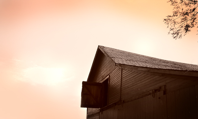
| This may have been more effective in b&w, as the pink tones seem very unnatural. |
|
 Photographer found comment helpful. Photographer found comment helpful. |
|
|
06/06/2007 11:30:13 PM |
| This is one those shots where I can't really tell you what I like about; I just know that it truly appeals to me. nice work. |
|
| Photographer found comment helpful. |
|
|
06/05/2007 11:28:20 AM |
| Interesting color contrast. Highlights left are blown-out. Lighting needs better control/balance. |
|
| Photographer found comment helpful. |
|
|
06/04/2007 11:41:34 PM |
| Lacks enough focus or detail on the building for me. Good luck in the challenge. |
|
| Photographer found comment helpful. |
|
|
06/02/2007 10:06:12 AM |
Wow this turned out nice... I really like the lighting here. I'm adding this to my fav list..
Good job 10 |
|
| Photographer found comment helpful. |
|
|
06/01/2007 04:49:17 PM |
| The colours don't work well here. |
|
| Photographer found comment helpful. |
|
|
06/01/2007 10:23:17 AM |
| lovely light and a nice clean image |
|
| Photographer found comment helpful. |
|
|
06/01/2007 09:40:04 AM |
| I love the simplicity and the color. Excellent. |
|
| Photographer found comment helpful. |
|
|
06/01/2007 05:23:17 AM |
| I like the colors of this and the perspective - but I am not a fan of the cropping with the open door right in the center of the image. The left side seems like completely wasted space. Cropping - reshooting so you are following more of the line of the roof (and including more of the tree above) could possibly help this one out. |
|
| Photographer found comment helpful. |
Home -
Challenges -
Community -
League -
Photos -
Cameras -
Lenses -
Learn -
Help -
Terms of Use -
Privacy -
Top ^
DPChallenge, and website content and design, Copyright © 2001-2025 Challenging Technologies, LLC.
All digital photo copyrights belong to the photographers and may not be used without permission.
Current Server Time: 03/12/2025 05:37:29 PM EDT.