| Author | Thread |
|
|
12/04/2006 03:50:28 AM |
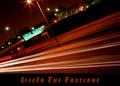
| Motivation is always good, great shot reminded me of Mr. Jingeling Keeper of the Keys, this time of year. |
|
|
|
01/07/2004 05:03:49 PM |
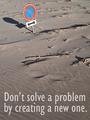
Greetings from the Critique Club:
This was a good concept for a motivational poster but is an image that isn't as strong as it might be. Much of this comes from the background which (on my monitor) comes across as uneven, a cream to a yellowish pinkish tone, on the left. This color doesn't set off the bronze of the key and key ring as well as another might have. The key itself seems truncated, and lacking in teeth. The hanging disc has a different font and that is startling - perhaps all text might do better in the same color. The disc also has a nick on the upper right edge that catches the eye and moves it away from your message. There also are some small flares of light that I am sure you are aware of. All of the above being said, the composition is simple and helps to support the message. Textures and clarity are good and the whole image would have some real impact if it were warmed up a bit. Thanks for the image. |
|
Comments Made During the Challenge  |
|
|
01/03/2004 04:07:33 PM |
| Composition is a bit flat so not as motivating. I think a bit less cream backgound might help |
|
 Photographer found comment helpful. Photographer found comment helpful. |
|
|
01/03/2004 03:32:17 AM |
| That key isn't going to do much for me. Use a key with more pronounced teeth or represents something with more passion, inspiration, or unlocks something much more worthwile. |
|
| Photographer found comment helpful. |
|
|
01/02/2004 08:25:31 PM |
| It's a good concept but 'Success' looks very unreal, unless it's position is just a coincidence :) |
|
| Photographer found comment helpful. |
|
|
01/02/2004 08:10:11 PM |
Looks more like a late night commercial than a poster?
I don't like the yellowish background.
Could really be improved upon.
Let us see it if you do another shot at it. |
|
| Photographer found comment helpful. |
|
|
01/02/2004 11:17:15 AM |
| Simple but effective composition. Well chosen elements and good lighting. The font used for "Success" doesn't work well with the font used for the rest of the text. |
|
| Photographer found comment helpful. |
|
|
12/31/2003 10:39:47 PM |
| very different and a great idea |
|
| Photographer found comment helpful. |
|
|
12/31/2003 02:34:53 PM |
| Simple, good photo, I like it - I just would like to see the hand, too, according to your message. |
|
| Photographer found comment helpful. |
|
|
12/30/2003 10:06:43 PM |
| Nice key texture and scratches. the text needs work adn this would be a pro effort. |
|
| Photographer found comment helpful. |
|
|
12/30/2003 07:04:52 PM |
| What a clever idea - I like the way the image really is key to the message (no pun intended!). A really unusual idea! Not keen on the font of the word Success - was that already enamelled onto the keyring or added by you? |
|
| Photographer found comment helpful. |
|
|
12/30/2003 12:43:53 AM |
| Very cool idea. Great shot. |
|
| Photographer found comment helpful. |
|
|
12/29/2003 05:38:05 PM |
| Nicely done. Compliments only. |
|
| Photographer found comment helpful. |
|
|
12/29/2003 09:34:23 AM |
| VERY nicely done. This makes a great photo/text for this challenge. Good luck ! |
|
| Photographer found comment helpful. |
|
|
12/29/2003 09:11:19 AM |
| Excellent image and typography - good quote. |
|
| Photographer found comment helpful. |
|
|
12/29/2003 03:10:14 AM |
| Very clever idea. LIke the composition and design. The only thing I am not so sure about is the yellowish cast the whole image has. Otherwise well done. |
|
| Photographer found comment helpful. |
Home -
Challenges -
Community -
League -
Photos -
Cameras -
Lenses -
Learn -
Help -
Terms of Use -
Privacy -
Top ^
DPChallenge, and website content and design, Copyright © 2001-2025 Challenging Technologies, LLC.
All digital photo copyrights belong to the photographers and may not be used without permission.
Current Server Time: 03/13/2025 01:28:16 AM EDT.