Greetings from the Critique Club.
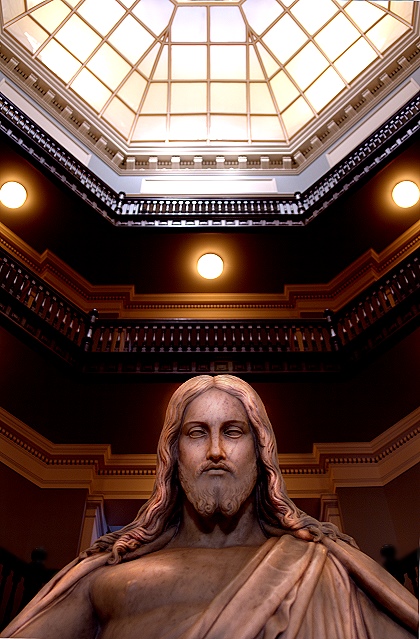
I gave this image a 5 during voting, and on second look, I think I underrated it. The composition is interesting, and there's lovely geometry present in the picture.
Conceptually it works well. The religious belief content of the picture is obvious, but effective - yes, divine light, lit from above, etc. The angle and composition work very well for this. Another thing that could be read into it is that everything in the picture comes in 3's, so there could be a reference to Jesus and the holy trinity in there somewhere.
However, what doesn't work well for me about this picture is that Jesus doesn't come across effectively as the main subject of the picture. A viewer's eye tends to go towards the areas of highlight first, so the first thing I looked at were the 3 little round windows, which seem to be a bit too prominent. The eye then travels towards the big glass window/ceiling thing, and you only notice Jesus as a sort of afterthought. Now, since this is in advanced editing, there's a considerable amount of control you have over this in pp - using a soft light layer and painting white across jesus and black across all the windows (and playing with the opacity to make the adjustments subtle) would have potentially improved the picture a lot. Also, burning the shadows on the statue at a low opacity can make the picture subtly more dramatic.
Also, a technical point: overall the exposure is good, but some of the window highlights seem a bit blown, using a shorter exposure might have helped. Even if it gives a slightly underexposed picture, you can bring out the subject in pp, whereas blown highlights are difficult to get rid of.
Overall I'd say this is an interesting entry which scored well, but with some improvements, it could have done even better. Well done anyway. |