| Author | Thread |
Comments Made During the Challenge  |
|
|
06/07/2007 11:49:26 PM |
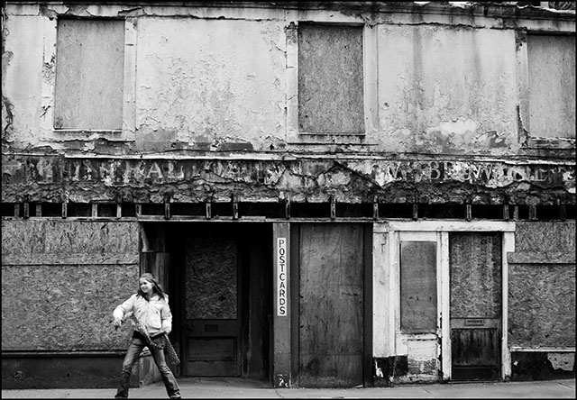
| The feet are cut off. That bugs me. |
|
|
|
06/07/2007 11:00:45 PM |
|
 Photographer found comment helpful. Photographer found comment helpful. |
|
|
06/07/2007 08:28:11 PM |
|
|
|
06/07/2007 08:31:35 AM |
tecnically the photo looks fine, nice b&w conversion with a good range in tones, I can't tell if the building is slanted or picture is, the roof tends to drop to the R. compositionally i see the relationship to the title and "postcards" but other than the girl there isn't much of interest. the building itself is very static with hard horizontal and vertical lines that may have been better if you'd tilted the camera to give a diagonal to them, another approach may have been to blur the girls motion to imply "lets get outta here" or something similar. hope this does well, you've got some nice ideas hear and good vision to see the opportunities too
6
Jack |
|
| Photographer found comment helpful. |
|
|
06/07/2007 01:03:02 AM |
| Clever title with the Postcards on the building. Nice B&W. |
|
| Photographer found comment helpful. |
|
|
06/05/2007 03:38:40 PM |
| Its a small detail, but her feet are out of the picture which keeps this from feeling complete. Otherwise, I like the candid nature of this shot. |
|
| Photographer found comment helpful. |
|
|
06/05/2007 10:03:45 AM |
| Great depth with this B&W. A lot have been flat and this one really has a depth to it. Good work. |
|
| Photographer found comment helpful. |
|
|
06/04/2007 03:36:51 AM |
| im not sure if anybody could think of a better title for this, i always end up cutting people feet off too! not sure if you means it or not either way i couldnt care less. i really like this. |
|
| Photographer found comment helpful. |
|
|
06/03/2007 07:18:05 PM |
| i really like this b/w photo a lot - the textures are outstanding, the tones wonderful, and the sighn and girl just set it out. |
|
| Photographer found comment helpful. |
|
|
06/03/2007 12:37:52 PM |
| With the title it seems there would be some more focus on the girl. Looking at this picture the focus is the building, maybe the building wishes you were there. hehe. Good photo. |
|
| Photographer found comment helpful. |
|
|
06/02/2007 01:58:51 PM |
| I like the composition and you've got good tonality. Too bad her feet are cut off though. |
|
| Photographer found comment helpful. |
|
|
06/01/2007 05:27:57 PM |
| Good tones but the focus should be on the girl not the wall. |
|
| Photographer found comment helpful. |
|
|
06/01/2007 02:12:39 PM |
| I don't understand how tht title relates to the image, but I also think that makes both more interesting. Neat pose, neat background. |
|
| Photographer found comment helpful. |