| Author | Thread |
|
|
06/24/2007 01:58:20 PM |
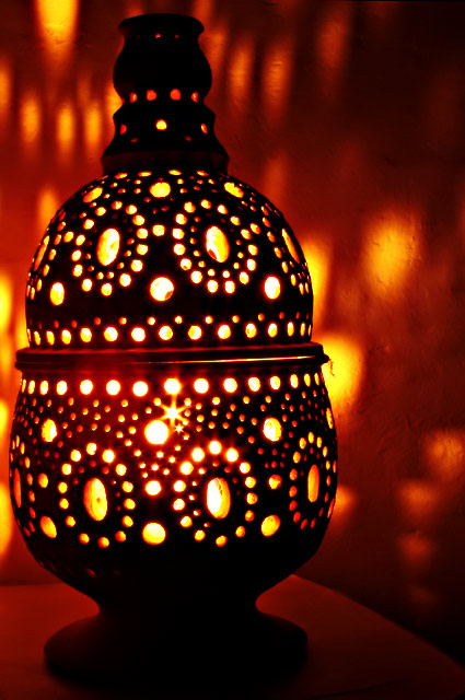
| I agree with kandykarmi about the composition. It feels to me like the lamp is too close to the left of the frame. Perhaps I would have liked it more if you had cropped off the top and bottom of the lamp, trying to draw my attention more to the circular patterns of light, and somehow got a mirror circular lighting on the wall behind. Keep it up! |
|
Comments Made During the Challenge  |
|
|
06/11/2007 12:30:41 PM |
|
|
|
06/11/2007 03:45:20 AM |
| Intresting nice sharp shot I like the heat waves |
|
|
|
06/10/2007 12:55:11 PM |
|
|
|
06/09/2007 04:24:56 PM |
| the light from within is pretty well captured - and the illumination of the walls works pretty well - but I really don't see the moving light source in this - but I may just be missing it - 6 |
|
 Photographer found comment helpful. Photographer found comment helpful. |
|
|
06/09/2007 10:32:39 AM |
| I'm not a fan of the crop on this.. It looks like it's leaning out of the edge a bit.. Maybe if you had just centered this it would give an appearance of being symmetrical.Also, there's some noise on the background too thats somewhat distracting. |
|
| Photographer found comment helpful. |
|
|
06/07/2007 02:16:01 AM |
| should be a little more focused |
|
| Photographer found comment helpful. |
Home -
Challenges -
Community -
League -
Photos -
Cameras -
Lenses -
Learn -
Help -
Terms of Use -
Privacy -
Top ^
DPChallenge, and website content and design, Copyright © 2001-2025 Challenging Technologies, LLC.
All digital photo copyrights belong to the photographers and may not be used without permission.
Current Server Time: 03/14/2025 01:18:28 PM EDT.