| Author | Thread |
Comments Made During the Challenge  |
|
|
09/07/2002 03:19:00 PM |
|
|
|
09/06/2002 12:53:00 PM |
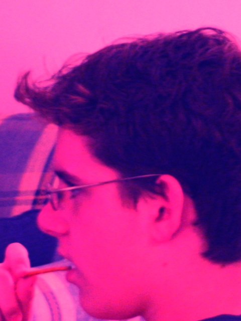
| that's one way to avoid blotchy skin tones! :-) just kidding. the wild colors do attrack attention, but they kinda of take away from the action. without your title, i would have thought he was putting a stick or something in his mouth. Good framing though. karmat |
|
|
|
09/06/2002 10:48:00 AM |
| I like the composition of this, and the colourisation was a bold move (I guess to make the most of a low-end camera), but it doesn't really work for me. It creates a very dramatic feeling when there's nothing to back it up in the image itself. The subject looks contemplative, not as excited as the garish colour would suggest. |
|
|
|
09/05/2002 09:52:00 AM |
| I'd be interested to see this photo before the filter was applied. I feel it spoils it for this particular challenge. |
|
|
|
09/05/2002 09:08:00 AM |
|
|
|
09/05/2002 01:41:00 AM |
|
|
|
09/04/2002 04:45:00 PM |
| ummmm. I never really liked Andy Wharhol, so maybe I'm biased. I don't think the color choice here did ANYTHING to add to this photo. It makes it stand out, but not in a positive way, at least to me. Composition: I would like to see a hair more beneath his chin, seems a bit cut off to me. Also, the fact that he is looking directly left makes me want to see what he's seeing. Sorry, I can't muster more than a 2 for this photo. It's the pink. 2, just-married |
|
|
|
09/04/2002 09:13:00 AM |
| I have no idea why this specific hue was chosen but it ruined your photo. |
|
|
|
09/04/2002 12:34:00 AM |
mood captured - attention caught by something else mid-bite
sincerity of expressions - good |
|
|
|
09/03/2002 10:54:00 PM |
| i like the strange hue choice |
|
|
|
09/03/2002 08:01:00 PM |
| Special effect? Too much loss of detail (can you see the earlobe?) 6 Swash |
|
|
|
09/03/2002 06:30:00 PM |
| Pink! Brilliant! Reminiscent of Andy Worhol.... I love it - 10 :) |
|
|
|
09/03/2002 09:06:00 AM |
Composition: Subject Placement, Cropping, Background6,
Technical: Focus, Exposure, Lighting, Processing5,
Appeal: Is it Interesting, Motivating, Etc.? 4,
Total Averaged Rating5. Autool
|
|
|
|
09/02/2002 11:45:00 PM |
| nice timing but I dont see a reson for the color choice. it just makes it harder to see the pretzel. |
|
|
|
09/02/2002 10:18:00 PM |
| The lighting is pretty bad, the composition is also subpar. Surely you can use a flash to help this :-) |
|
|
|
09/02/2002 09:08:00 PM |
| I'm afraid I'm not too impressed with this one. I just don't get the whole pink effect, or what it's trying to convey. |
|
|
|
09/02/2002 08:23:00 PM |
| Don't understand, why red not clear... |
|
|
|
09/02/2002 07:51:00 PM |
| Sorry the color is a bit too much for me.Spiller |
|
|
|
09/02/2002 06:41:00 PM |
| I'm not sure if the red of this photo is the desired effect, but its a bit distracting. |
|
|
|
09/02/2002 03:37:00 PM |
| I'm not too crazy about the pink. |
|
|
|
09/02/2002 02:32:00 PM |
| what's with the colour? Was it purposeful? |
|
|
|
09/02/2002 11:29:00 AM |
| I don't personally like the pink cast to this? What were your thoughts that led you this way? Candid of a person eating, but too cut off at the neck. Quality is noisy. Did you crop a small area from the larger image? |
|
|
|
09/02/2002 09:56:00 AM |
| I am having a problem with the graininess and strange colorization, not to mention the choice of cropping. |
|
|
|
09/02/2002 02:13:00 AM |
| how come you took this in a pink filter? |
|
|
|
09/02/2002 12:25:00 AM |
| The Hue doesnt appeal to me. |
|
Home -
Challenges -
Community -
League -
Photos -
Cameras -
Lenses -
Learn -
Help -
Terms of Use -
Privacy -
Top ^
DPChallenge, and website content and design, Copyright © 2001-2025 Challenging Technologies, LLC.
All digital photo copyrights belong to the photographers and may not be used without permission.
Current Server Time: 03/12/2025 12:52:27 PM EDT.