| Author | Thread |
Comments Made During the Challenge  |
|
|
06/10/2007 11:39:45 AM |
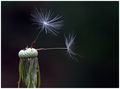
| Nicely lit and sharp. Lower left flower has some blown color highlights on its petals. |
|
 Photographer found comment helpful. Photographer found comment helpful. |
|
|
06/09/2007 04:12:41 PM |
| Good details in the petals and centers, and I like that they're not the exact same colors. Seems a bit overprocessed though since they feel like they're floating above the black, or cut out of the background, and you've lost some of the petal tips to the blown out yellows. |
|
| Photographer found comment helpful. |
|
|
06/07/2007 11:48:57 AM |
| nicely composed. the difference in lighting of the two flowers bothers me a little though. I would have liked to see the top flower a little brighter. |
|
| Photographer found comment helpful. |
|
|
06/05/2007 08:35:15 PM |
Fit Challenge Criteria: 2/2
Contrast/Color: 1/2
Composition: 2/2
Photo Quality: 1/2
My Subjective Affinity: 1/2
I really like the subjects, and the placement of them in the frame. My only major dislike is that the petals of the lower flower, on the upper-left, seem blown out. I can't see the detail all the way to the end like I can on the majority of the petals. The upper flower is also just a tad bit too dark in the center IMO. |
|
| Photographer found comment helpful. |
|
|
06/05/2007 05:50:24 PM |
Yup!
Works for me.
Love the colours
Kev |
|
| Photographer found comment helpful. |
|
|
06/04/2007 12:37:03 AM |
| Nice detail and focus. I'm not a fan of the yellow border though. ;~D |
|
| Photographer found comment helpful. |
Home -
Challenges -
Community -
League -
Photos -
Cameras -
Lenses -
Learn -
Help -
Terms of Use -
Privacy -
Top ^
DPChallenge, and website content and design, Copyright © 2001-2025 Challenging Technologies, LLC.
All digital photo copyrights belong to the photographers and may not be used without permission.
Current Server Time: 03/14/2025 09:35:53 AM EDT.