| Author | Thread |
|
|
06/14/2007 02:07:57 AM |
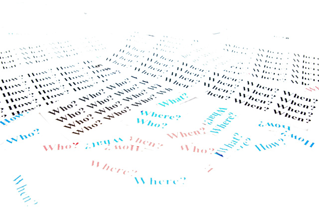
It was a test that failed. I have learned from it. The funniest thought is that it actually received one vote from each score on the chart. So, the hatred of it is not universal.
I liked the dreamy look, which made me try reading all the papers, with the words on them. Upon reflection, I think a less exposed, closer shot, maybe on a different backdrop (not a white board) would have been better.
|
|
Comments Made During the Challenge  |
|
|
06/12/2007 10:41:22 PM |
|
|
|
06/12/2007 10:15:57 AM |
|
|
|
06/11/2007 06:24:48 PM |
| There is no real subject for the eye to focus on here, it feels rather jumbled. |
|
|
|
06/08/2007 08:57:47 PM |
| it's too bright for my taste |
|
 Photographer found comment helpful. Photographer found comment helpful. |
|
|
06/08/2007 06:32:18 PM |
| I like the concept of this shot, but feel that it is too bright... I wouldnt mind seeing more contrast and definition on the words, especially the colourful words up close. |
|
| Photographer found comment helpful. |
|
|
06/08/2007 07:17:02 AM |
Good idea, but a little overexposed IMO....
I am not a good photographer, I do not claim to be better than anyone, any criticism is meant to be constructive criticism...... |
|
| Photographer found comment helpful. |
Home -
Challenges -
Community -
League -
Photos -
Cameras -
Lenses -
Learn -
Help -
Terms of Use -
Privacy -
Top ^
DPChallenge, and website content and design, Copyright © 2001-2025 Challenging Technologies, LLC.
All digital photo copyrights belong to the photographers and may not be used without permission.
Current Server Time: 03/11/2025 01:46:23 PM EDT.