| Author | Thread |
|
|
06/06/2007 09:52:43 PM |
| Nicely Done!I llike the lighting and simple composition on this. |
|
 Photographer found comment helpful. Photographer found comment helpful. |
|
|
06/06/2007 05:09:32 PM |
|
| Photographer found comment helpful. |
|
|
06/06/2007 03:23:21 PM |
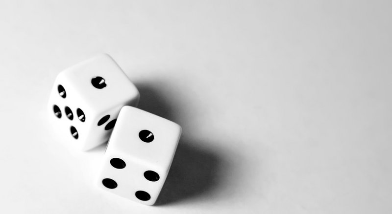
| I like the composition and the amount of white space in this shot. The lighting looks good, IMO, and the shadow is just right too. |
|
| Photographer found comment helpful. |
|
|
06/05/2007 10:35:26 PM |
| I think I was going for longer shadows or more contrast or something. Something more interesting to look at, I guess! :) I think those that said it needed a darker background were right, I think that would have helped. I think I also needed to work with the lighting a little bit more. I really appreciate all the great comments. They were extremely helpful! Maybe I'll give this shot another try! |
|
|
|
06/05/2007 10:23:07 PM |
| Care to share what you were going for? The shadows help give the dice a 3d look. The other side blends a lot with the background so the 3d aspect dissappears. If the picture was rotated just a bit more clockwise, a greater tension would be created making the dice look like they were falling. Was that what you were trying to do/show? A vertical composition would work better in that case. Upper placement of the dice with lots of room for them to fall into. |
|
| Photographer found comment helpful. |
|
|
06/05/2007 10:13:05 PM |
| I like the composition but also feel that a little darker background for some contrast would help. |
|
| Photographer found comment helpful. |
|
|
06/05/2007 08:46:43 PM |
| The dice came out nicely, but it might be worth trying this again on a darker background. |
|
| Photographer found comment helpful. |
|
|
06/05/2007 07:28:41 PM |
| Nice simple shot.. for me the corners of the dice get lost in the background just a bit with the brightness. I'm not sure what you were going for when you said this wasn't quite what you envisioned, but it looks like you were going for those long shadows perhaps? If so, I think moving the light source down even further, even to the point of losing the highlights on the top pips, might help? Then again, you could have been aiming for something completely different :) |
|
| Photographer found comment helpful. |
|
|
06/05/2007 07:21:22 PM |
| The placement of the dice gives it interest. |
|
| Photographer found comment helpful. |
|
|
06/05/2007 05:23:12 PM |
| I like the simplicity and placement of the dice in the crop-neat shadows as well. |
|
| Photographer found comment helpful. |
|
|
06/05/2007 04:17:49 PM |
| My first impression is I like the close crop at the bottom. I think it makes the dice look as if they are coming out of the picture. There is more of a three dimensional feeling. Very bright but not to bright I think any more would have gone to far. As is, perfect. |
|
| Photographer found comment helpful. |
Home -
Challenges -
Community -
League -
Photos -
Cameras -
Lenses -
Learn -
Help -
Terms of Use -
Privacy -
Top ^
DPChallenge, and website content and design, Copyright © 2001-2025 Challenging Technologies, LLC.
All digital photo copyrights belong to the photographers and may not be used without permission.
Current Server Time: 04/12/2025 01:38:38 PM EDT.