| Author | Thread |
|
|
01/17/2004 10:40:31 PM |
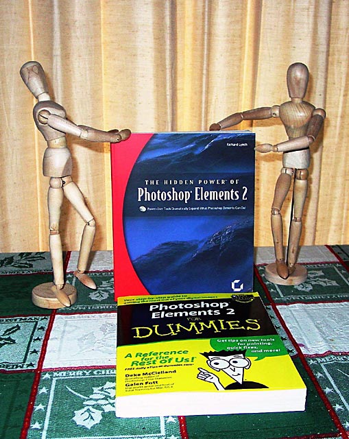
| I think the books would have stood out more better with another plain table cloth. Its got a good focus to the hole thing though in general. I need to buy me those books thats the photo program I am haveing a tough time learning! |
|
Comments Made During the Challenge  |
|
|
01/12/2004 05:42:12 PM |
|
 Photographer found comment helpful. Photographer found comment helpful. |
|
|
01/11/2004 07:34:52 PM |
| Think I'd have preferred it with only one book - the bottom one moved to a different position obviously. Also a plain background would have helped. Nice idea though. |
|
| Photographer found comment helpful. |
|
|
01/11/2004 08:04:26 AM |
| Cool idea. Background could have been much better. |
|
| Photographer found comment helpful. |
|
|
01/11/2004 05:36:44 AM |
| You're right. Been there. Still there. |
|
| Photographer found comment helpful. |
|
|
01/10/2004 09:42:39 AM |
| The background is too busy in this shot. |
|
| Photographer found comment helpful. |
|
|
01/10/2004 04:48:20 AM |
| Funny. Relevant to challenge. Obviously laid-out with care, but I am certain this guy/gal could have given us a more inspired setting. Soundly lit and exposed. |
|
| Photographer found comment helpful. |
|
|
01/08/2004 11:57:42 PM |
| Mannequins are posed very well. They have character. Background makes it look like they are on stage, but the yellow could have been eliminated and I don't like the green tablecloth. Lighting is a bit strong, but there are no glaring areas, so this is not really a problem. Finally, the table line is slanted and needs some rotation. |
|
| Photographer found comment helpful. |
|
|
01/08/2004 12:50:19 PM |
| seems that the photo quality could be a little better (almost and irony). fun though |
|
| Photographer found comment helpful. |
|
|
01/08/2004 11:49:21 AM |
| the tablecloth and curtain are distracting. something a little more plain would have worked better. i think a different arrangement would have been better also. good idea |
|
| Photographer found comment helpful. |
|
|
01/07/2004 08:55:49 PM |
| Not a bad idea here. I think this would look much better with a solid background and tabletop. The patterns and colors of your tablecloth and drapes are too distracting. With the wood guys holding up and showcasing the book, it might be better if the other one wasn't in the picture. Good luck with your resolution! :-) |
|
| Photographer found comment helpful. |
|
|
01/07/2004 11:02:24 AM |
| Maybe a black backdrop would make this picture better. |
|
| Photographer found comment helpful. |
|
|
01/07/2004 06:16:23 AM |
| ah the dummies books... nice idea, but more thought to the floor and background. |
|
| Photographer found comment helpful. |
Home -
Challenges -
Community -
League -
Photos -
Cameras -
Lenses -
Learn -
Help -
Terms of Use -
Privacy -
Top ^
DPChallenge, and website content and design, Copyright © 2001-2025 Challenging Technologies, LLC.
All digital photo copyrights belong to the photographers and may not be used without permission.
Current Server Time: 03/12/2025 02:26:32 PM EDT.