Greetings from the critique club! Thanks for the opportunity to critique your shot.
Pros:
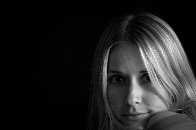
I really think this picture has a lot going for it. The expression is great, background is perfectly black, composition is interesting and effective. The B&W conversion is perfectly adequate, though perhaps a little more contrast would have been good; better than most of mine, anyway. Not that that's anything to brag about. Which raises the question, why did it score well below average? This brings us to...
Cons:
You do have a few technical and compositional issues here.
First, and this is almost certainly your biggest problem, is that the shot is a bit soft. At f/5.6 the lens should be performing well, but 1/2 second is very long for a portrait, particularly up close - any tiny movement will lead to blur. It also looks like your light was quite low, so your autofocus might not be at its best. So step 1 - brighter lights! Menards halogen worklights. Hot, but cheap. Also it doesn't look like you did any sharpening? That would have helped, some.
Second, and speaking of lighting, some of the shadows are a tetch harsh; not terrible, but around the eyes and from the hair. Of course, a halogen worklight will make this worse, not better - so bounce it off a wall, and use a reflector (tin foil on cardboard) to provide some fill from the other side.
Finally, the bit that I believe is her shoulder should be not there; it's confusing and distracting.
The Challenge
This was a very open ended challenge, and I think you met it fine.
Overall, I think this is a good shot with great promise; I'm frankly surprised it didn't do somewhat better but sometimes you just rub the voters the wrong way with a perfectly good shot. I hope you stick with us, and I'd encourage you to try this shot again with a few of the technical issues fixed. Feel free to write me if you have any questions; I really do like this picture.
-Evan |