| Author | Thread |
Comments Made During the Challenge  |
|
|
06/17/2007 09:38:41 PM |
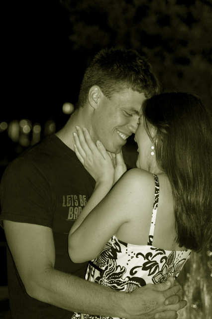
| awwwwwww. Green balance is interesting - but it works. |
|
 Photographer found comment helpful. Photographer found comment helpful. |
|
|
06/16/2007 12:03:11 AM |
| Nice moment & well captured, the yellow tone is intresting but perhaps a bit too strong. Good Luck |
|
| Photographer found comment helpful. |
|
|
06/15/2007 12:36:52 AM |
| Wonderful shot. Love the emotion and tenderness you've caught here. Nice toning. I wish there were a tad more separation between the tops of the heads and the bg. Still lovely. |
|
| Photographer found comment helpful. |
|
|
06/14/2007 06:29:37 AM |
great moment, wish we could see a bit more of the girl
6
Jack |
|
| Photographer found comment helpful. |
|
|
06/13/2007 03:03:40 AM |
Very nice moment of intimacy, only minor thing is that (i think) one of the lights in the background has quite a strnge effect on the image making it appear as if the girl is either sticking her tongue out slightly or has very odd shaped lips, possibly a touch of dodge/burning may have helped
Even as it is a good 7 |
|
| Photographer found comment helpful. |
|
|
06/12/2007 03:05:21 PM |
| But he's wearing a shirt that says, "Let's be bad"! LOL! I love the irony! |
|
| Photographer found comment helpful. |
|
|
06/11/2007 10:00:26 PM |
| Very nice..although a crop at the top would help. |
|
| Photographer found comment helpful. |
|
|
06/11/2007 01:36:12 PM |
| I don't really like the green hue but this is a cute moment |
|
| Photographer found comment helpful. |
|
|
06/11/2007 12:30:06 PM |
| feels like they really are happy! nice! |
|
| Photographer found comment helpful. |
|
|
06/11/2007 11:01:36 AM |
| Love the shot but not a fan of the coloring...seems a little too "green" |
|
| Photographer found comment helpful. |
|
|
06/11/2007 06:58:39 AM |
| Pet peeve... chopping off fingers when most of the hand is in shot. The green sepia looks terrible. But you've caught a nice moment. It almost looks posed, but I'll give you the benefit of the doubt. You could crop much tighter, there's way too much negative space at the top. I don't like it that you can't read the writing on the t-shirt, be careful if there's text in a photo. It makes you want to read the rest of it. |
|
| Photographer found comment helpful. |
|
|
06/11/2007 01:13:13 AM |
| Would be better with a tighter crop on top and without the green hue. |
|
| Photographer found comment helpful. |
Home -
Challenges -
Community -
League -
Photos -
Cameras -
Lenses -
Learn -
Help -
Terms of Use -
Privacy -
Top ^
DPChallenge, and website content and design, Copyright © 2001-2025 Challenging Technologies, LLC.
All digital photo copyrights belong to the photographers and may not be used without permission.
Current Server Time: 03/14/2025 09:37:49 AM EDT.