| Author | Thread |
|
|
07/19/2007 03:43:33 AM |
this is awesome Whiterook - I think this is great
|
|
|
|
06/27/2007 05:41:02 AM |
| Not up to your usual standards there WR. And almost 20 places off the brown! |
|
 Photographer found comment helpful. Photographer found comment helpful. |
Comments Made During the Challenge  |
|
|
06/26/2007 07:13:03 PM |
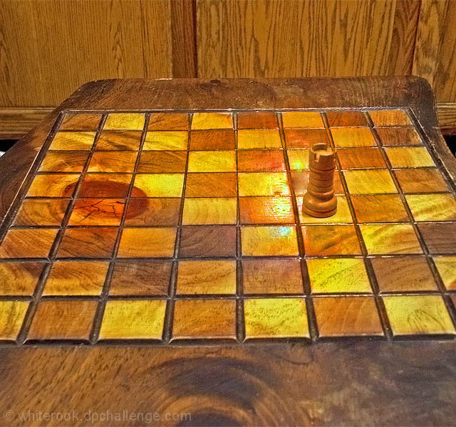
| I consider this OOB. everything is wood, so in a sense it all blends together. this reminds me of Stevens' Jar In Tennessee. A single item put into a place defines the place. whiterook defines his world... |
|
| Photographer found comment helpful. |
|
|
06/26/2007 06:15:59 PM |
very clever both in execution and in the title, one of a series I'm guessing
5 - to neither reward or punish
Jack |
|
| Photographer found comment helpful. |
|
|
06/26/2007 03:49:38 PM |
| It would be better if you left out the cabinet in the background... |
|
| Photographer found comment helpful. |
|
|
06/26/2007 07:11:16 AM |
| Because the entire image is brown it is hard to see the subject; thus there is no obvious negative space. |
|
|
|
06/25/2007 06:56:33 PM |
| This is too monotone imo. |
|
|
|
06/25/2007 08:37:39 AM |
| Looks like nice details throughout the photo, however the blown section (flash or light) takes away quite a bit. Some color contrast would add more as well (bright white rook or other color). All of the colors in the photo are very similar making everything blend together. |
|
|
|
06/24/2007 12:29:10 AM |
| I'm not seeing much negative space here. |
|
|
|
06/23/2007 08:37:17 PM |
| I like the concept! However, the angle just isn't good forme :( |
|
| Photographer found comment helpful. |
|
|
06/22/2007 10:28:34 PM |
| I'm not big on the tone of this photograph. Perhaps a bit lower aspect and crop out the forground and background wood (make it more of a square) would help accentuate the rook. There is a light causing a glare on this pretty board. If you can reshoot, try moving the rook one square closer, get down lower and you might get rid of that glare (or move the light if possible). Then crop square. You might be pleasantly surprise. Nice idea. |
|
| Photographer found comment helpful. |
|
|
06/21/2007 12:32:21 AM |
| This shot just seems to busy to have negative space in it. I'm looking all over the place. Maybe straightening out the picture and a tighter crop would have been better. |
|
|
|
06/20/2007 04:14:25 PM |
Did you miss the last challenge?
You are missing the neg. space component. |
|
| Photographer found comment helpful. |
|
|
06/20/2007 04:06:30 PM |
| The negative space in this image is too busy to have much impact. It is a nice table though! :) |
|
Home -
Challenges -
Community -
League -
Photos -
Cameras -
Lenses -
Learn -
Help -
Terms of Use -
Privacy -
Top ^
DPChallenge, and website content and design, Copyright © 2001-2025 Challenging Technologies, LLC.
All digital photo copyrights belong to the photographers and may not be used without permission.
Current Server Time: 03/14/2025 06:37:50 PM EDT.