| Author | Thread |
|
|
06/27/2007 12:07:23 AM |
| Thanks everyone. I wasn't sure if Curves was allowed in Basic Editing. |
|
Comments Made During the Challenge  |
|
|
06/26/2007 07:07:59 PM |
| cool photo! not much negative space, but my eye kind of creates it. interesting effect. |
|
|
|
06/26/2007 05:56:43 PM |
| needs a bit more contrast, but cool shot |
|
|
|
06/26/2007 05:32:14 PM |
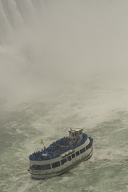
| Great use of space to accentuate scale. Like the muted tones too. This kind of took me back for a second, nice one. |
|
 Photographer found comment helpful. Photographer found comment helpful. |
|
|
06/26/2007 05:17:36 PM |
| what a great perspective. the awesomeness of nature! |
|
|
|
06/25/2007 05:51:11 PM |
| Now this is where the neg space creates the wow factor but the technicals aren't great on it. Some suggestions that may or may not work... increase contrast and midtones; increase color in the water (probably green or cyan?). Of course these may not work because you may end up blowing out Niagera in places but you may be able to compensate that by decreasing highlights. The whole thing just looks too hazy for me which is what I would try to overcome in pp if it were my shot. |
|
| Photographer found comment helpful. |
|
|
06/23/2007 12:28:42 AM |
| This is quite interesting. I love the composition and the textures. Wonder if you could have pulled a bit more contrast. The mist is making it look a bit flat when we know it isn't. Nice job. |
|
| Photographer found comment helpful. |
|
|
06/21/2007 05:35:32 PM |
| Good subject and appropriate use of negative space. A bit of post processing would make this look a lot better (I just tried a simple auto curves and found it made a big difference to the colour and clarity of this photo). |
|
| Photographer found comment helpful. |
|
|
06/20/2007 06:02:48 PM |
| Man I love this place... I was one of the blue specs at one time. difficult shot that you did a nice job on. |
|
Home -
Challenges -
Community -
League -
Photos -
Cameras -
Lenses -
Learn -
Help -
Terms of Use -
Privacy -
Top ^
DPChallenge, and website content and design, Copyright © 2001-2025 Challenging Technologies, LLC.
All digital photo copyrights belong to the photographers and may not be used without permission.
Current Server Time: 03/14/2025 05:12:34 PM EDT.