| Author | Thread |
|
|
06/28/2007 09:05:22 AM |
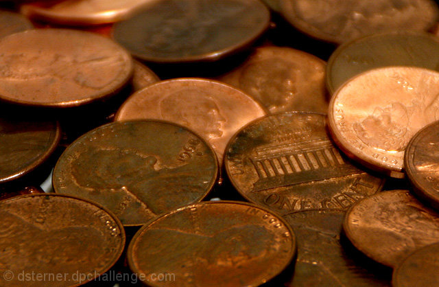
I think to really irk the voters you should have added a really obnoxious border lol. Actually, I think a black border would have looked pretty good. I am surprised this got the kind of score it did. You must have gotten 1's, 2's, and 3's from people who are irked that the US still is using pennies in the currency system :D
I like the comp (although I don't think you needed those white parts). The lighting is fine and the fly-by voters must have missed the fact that one of the pennies is flipped over. You are just too subtle for the fast-food voters, you sly one you :D |
|
 Photographer found comment helpful. Photographer found comment helpful. |
Comments Made During the Challenge  |
|
|
06/21/2007 07:25:06 PM |
| Nice composition and contrast. |
|
| Photographer found comment helpful. |
|
|
06/20/2007 05:29:07 PM |
Looks kinda dull. Shiny pennies and more imaginative lighting would make this pop better.
TC |
|
| Photographer found comment helpful. |
|
|
06/20/2007 02:03:29 PM |
| If the lighting was a bit stronger on the "tails" so that it stood out more, this shot would be much more effective. |
|
| Photographer found comment helpful. |
|
|
06/20/2007 06:33:19 AM |
| intersting colours bit not much else, the coins probably should have filled all the gaps to the table, Good Luck |
|
| Photographer found comment helpful. |
Home -
Challenges -
Community -
League -
Photos -
Cameras -
Lenses -
Learn -
Help -
Terms of Use -
Privacy -
Top ^
DPChallenge, and website content and design, Copyright © 2001-2025 Challenging Technologies, LLC.
All digital photo copyrights belong to the photographers and may not be used without permission.
Current Server Time: 03/14/2025 09:39:29 AM EDT.