Greetings from the Critique Club
Initial thoughts/My opinion
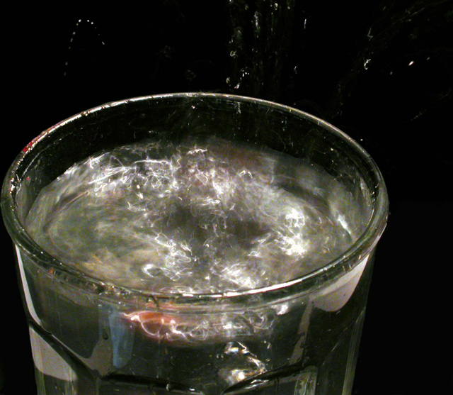
Great idea: very different to other water images, has some technical and compositional shortcomings, leading to a lag of WOOW-factor.
Content/Composition
The content is just great: The water surface you show us is full of vibration, texture and live: very dynamic, full of action and life.
In Germany there is a saying "Storm in the water glass" and in means "making a big fuzz about something very unimportant". Your image shows this very well.
The composition comes somehow short at several points. The water glass you choose isn't very attractive: a simpler one with thinner glass and without any structure (by that I do mean the shape at the bottom) would be better. The angle of view and the cropping might be improvable too, however, I can't tell in which direction to go, one simply has to try it. The droplets flying around are also a problem: in the image they are not strong enough to make an important compositional element, so it would be better to either not showing them or increase them much more to give them an importance equivalent to the water surface.
One main point is the colour and light: there is some colour shown and that is important. Without it, i.e. B&W, the image would be very flat. I would have strengthened colour by using light reflected from coloured paper or so and also by a coloured background (the later might not work though). That would have increased the dynamic of the image considerably. Of course the glass rim would show this colouration too, but with a better glass this would have made up just a probably nicely coloured line. Right now the red at the left rim just does not look nice, looks more like dirt.
Camera work -technically
Exposure seems fine, but it's hard to tell here, because the exposure is the main control to get the texture on the busy water right. Focus seems fine too, although not of great importance here.
Digital Processing - Technical
The image looks a little over-sharpened to me, otherwise fine. As mentioned: I would have used a different cropping. Negative space is not of importance here IMO.
Fits the challenge
Yes, for sure.
Good luck for your further submissions
|