| Author | Thread |
Comments Made During the Challenge  |
|
|
06/25/2007 06:09:59 PM |
not really any negative space imo
5
Jack |
|
 Photographer found comment helpful. Photographer found comment helpful. |
|
|
06/25/2007 02:51:49 PM |
|
| Photographer found comment helpful. |
|
|
06/25/2007 08:40:29 AM |
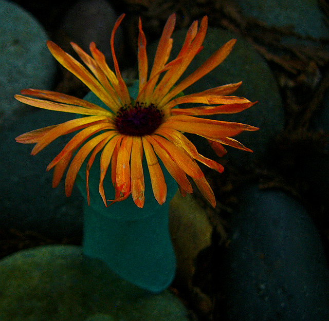
| I'm not sure how you processed this, but I like it. It looks like a painting. Very subdued colors. 9 |
|
| Photographer found comment helpful. |
|
|
06/24/2007 05:34:50 PM |
|
| Photographer found comment helpful. |
|
|
06/22/2007 10:13:18 PM |
| I keep hoping this will brighten up just a touch. Perhaps use a larger apeture or adjust exposure. Color is amazing and to me it would POP much more if the light were hitting the flower a bit more. Nice negative space. |
|
| Photographer found comment helpful. |
|
|
06/21/2007 11:24:38 PM |
| I really like the colors and the processing. |
|
| Photographer found comment helpful. |
|
|
06/21/2007 11:17:44 AM |
|
| Photographer found comment helpful. |
|
|
06/20/2007 11:08:45 PM |
| color doesn't look as sharp as it should, but the orange with the aqua makes up for it. very nice. |
|
| Photographer found comment helpful. |
|
|
06/20/2007 07:36:56 PM |
| There is such a beauty in tired, dying flowers. Great mood from the darkness here, but your focus is a little off. Still, a wonderful choice of subject and treatment. |
|
| Photographer found comment helpful. |
Home -
Challenges -
Community -
League -
Photos -
Cameras -
Lenses -
Learn -
Help -
Terms of Use -
Privacy -
Top ^
DPChallenge, and website content and design, Copyright © 2001-2025 Challenging Technologies, LLC.
All digital photo copyrights belong to the photographers and may not be used without permission.
Current Server Time: 04/26/2025 08:37:49 PM EDT.