| Author | Thread |
Comments Made During the Challenge  |
|
|
09/14/2002 06:44:00 PM |
| great use of color and lighting |
|
|
|
09/14/2002 02:01:00 PM |
| Nice playful use of colors. |
|
|
|
09/14/2002 01:02:00 PM |
| Very nice colors, good brightness/contrast, an well focused. Good job! Good luck in the callenge. Gracious aka Grayce |
|
|
|
09/14/2002 11:18:00 AM |
| Like the contrast in colour and the sharpness. Nice arrangement. |
|
|
|
09/14/2002 04:02:00 AM |
colors are a WOW.
I wonder which camera is this. |
|
|
|
09/13/2002 09:00:00 PM |
Composition - quite good
Technical Aspects - quite good
Meets Challenge - yes
Visual Impact / Originality � quite high
Other suggestions �
7
Jim msp
|
|
|
|
09/13/2002 05:40:00 PM |
| Love the color contrast between the red and green |
|
|
|
09/13/2002 05:26:00 AM |
|
|
|
09/12/2002 04:29:00 PM |
| Lovely study of colours and shapes. |
|
|
|
09/12/2002 02:55:00 AM |
| I like the perspective, the composition and the colors. 7 sjgleah |
|
|
|
09/11/2002 10:55:00 AM |
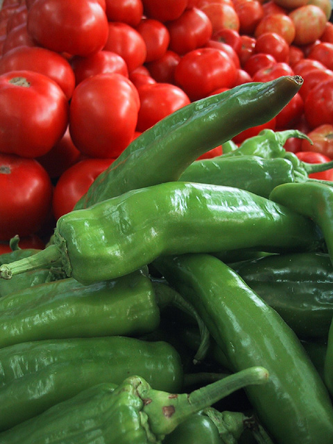
Lovely contrast in colors, nice depth. Good job on this one.
I would have shot with the second from the top pepper, the horizontal one, as the bottom frame of the shot. Just an idea.
8 |
|
|
|
09/11/2002 09:41:00 AM |
Composition: Subject Placement, Cropping, Background6,
Technical: Focus, Exposure, Lighting, Processing7,
Appeal: Is it Interesting, Motivating, Etc.? 6,
Total Averaged Rating6. Autool
|
|
|
|
09/11/2002 08:55:00 AM |
| A good contrast of colors and shapes. |
|
|
|
09/10/2002 10:51:00 PM |
|
|
|
09/10/2002 06:25:00 PM |
| Nice combination of colors. Also a good clean image. I like how the composition gives the impression of an almost endless supply of tomatoes. |
|
|
|
09/10/2002 04:58:00 PM |
|
|
|
09/10/2002 12:09:00 PM |
| Great use of colour and contrast. Can't find fault� |
|
|
|
09/10/2002 11:48:00 AM |
| i love the contrasting colours in this photo! good job! |
|
|
|
09/10/2002 07:36:00 AM |
| I love the red and green in this image. Those colours really seem to go together really well. Great job. |
|
|
|
09/09/2002 10:13:00 PM |
| Me gusta el tÃtulo. Very pretty composition. Good idea not to mix them, and leave a first plane green and a red background. Pretty good job at executing. I would have changed the central character (the top chile) for a nicer one at the tip. Atention to details makes the difference. |
|
|
|
09/09/2002 04:29:00 PM |
| Yep, it works for me: I like the green against the red. Good DOF.... I hope you didn't have to buy the lot :-) 8. marcvg |
|
|
|
09/09/2002 03:18:00 PM |
| I really like the red/green contrast here. Good composition. karmat |
|
|
|
09/09/2002 09:47:00 AM |
| Love them both! Nice shot, good color and light. |
|
Home -
Challenges -
Community -
League -
Photos -
Cameras -
Lenses -
Learn -
Help -
Terms of Use -
Privacy -
Top ^
DPChallenge, and website content and design, Copyright © 2001-2025 Challenging Technologies, LLC.
All digital photo copyrights belong to the photographers and may not be used without permission.
Current Server Time: 03/12/2025 06:15:38 PM EDT.