| Author | Thread |
|
|
07/11/2007 11:14:04 AM |
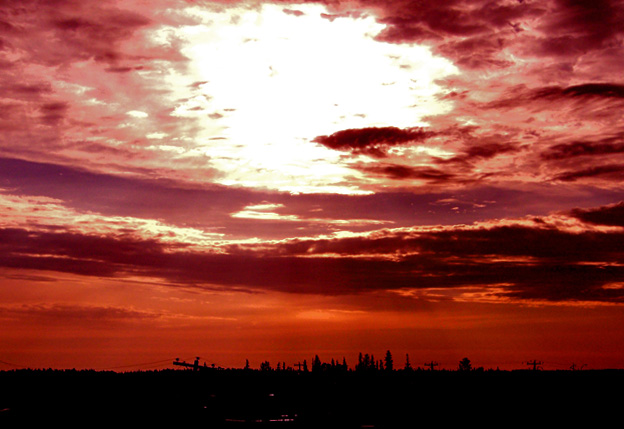
| Well... I saw some of the commenters didn't like the color, but IMO there's not at all too much red. This is a very interesting color. Instead, I think the problem might be that the light is sort of over-exposed and the contrast is a little harsh... But I'm not really sure how you could have fixed this. If you had darkened the photo so that the sky was exposed right, then the neat details of the city in the distance would have been lost in shadow. Perhaps if you could have found a way to shoot the picture without the sun this might have worked better. Or you could just crop the sun out. But I really like the combination of tree-tops and telephone wires on the horizon... it creates a very interesting feeling when you look at it. Great job! |
|
 Photographer found comment helpful. Photographer found comment helpful. |
Comments Made During the Challenge  |
|
|
07/07/2007 08:59:08 PM |
| Just too much red......looks too fake |
|
| Photographer found comment helpful. |
|
|
07/07/2007 05:07:45 PM |
|
|
|
07/06/2007 10:34:22 PM |
| A little bright up top. Other than that it's a cool shot. 7 |
|
|
|
07/05/2007 11:16:51 AM |
| I would of like to see more detail in the earth because the challenge is about the land. |
|
|
|
07/04/2007 10:12:46 AM |
| overexposed and overprocessed, the colors look very unnatural |
|
|
|
07/04/2007 09:53:14 AM |
| great colours and silhouttes - too bad about the burnt out spot in the sky |
|
|
|
07/04/2007 08:13:01 AM |
| This appears to be overly saturated, which makes the blown-out area of the sky (huge and centered, no less!) conspicuous. |
|
Home -
Challenges -
Community -
League -
Photos -
Cameras -
Lenses -
Learn -
Help -
Terms of Use -
Privacy -
Top ^
DPChallenge, and website content and design, Copyright © 2001-2025 Challenging Technologies, LLC.
All digital photo copyrights belong to the photographers and may not be used without permission.
Current Server Time: 03/12/2025 02:43:41 PM EDT.