| Author | Thread |
|
|
01/28/2004 01:03:36 AM |
| Underexposed on purpose, but whatever. |
|
Comments Made During the Challenge  |
|
|
01/26/2004 03:13:34 AM |
|
 Photographer found comment helpful. Photographer found comment helpful. |
|
|
01/24/2004 01:44:41 PM |
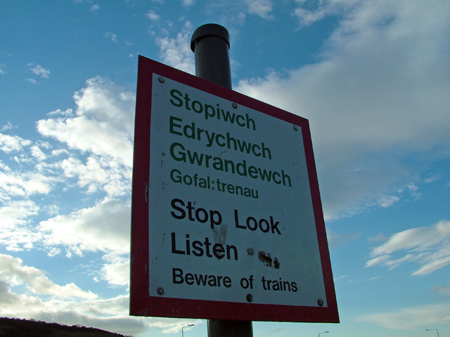
| Great overall image! I like the clouds and the sky. The sign is interesting however it looks a bit under exposed. Not sure if it was possible but maybe crop the bottom a bit closer to eliminate the annoying street lights and maybe the hill. |
|
| Photographer found comment helpful. |
|
|
01/24/2004 11:13:30 AM |
| Great shot, may have improved it with forced flash. |
|
|
|
01/22/2004 09:37:04 PM |
|
|
|
01/21/2004 01:59:28 PM |
now.. listen..
the sign is in the shadows, that makes it all gray.. if you have had used the flash maybe the sign is more bright then.
and the black area on left-bottom corner is bad.
personally i think it is a good find, but not as good picture. |
|
|
|
01/21/2004 12:00:43 PM |
| Beautiful composition. The picture reveals a underexposed sign. A common lack in this challenge. This happen because of metering system. In this type of pictures you need to target the horizon, setup the exposition, lock it, then recompose your scene focus and shoot. |
|
| Photographer found comment helpful. |
|
|
01/21/2004 11:45:20 AM |
| Interesting sign and a great sky. Unfortunately, the sky tends to obscure the sign. IMHO this could be cropped a lot tighter to ber more effective. Cropping from the lright would put the sign off center and make this a better composition. |
|
| Photographer found comment helpful. |
Home -
Challenges -
Community -
League -
Photos -
Cameras -
Lenses -
Learn -
Help -
Terms of Use -
Privacy -
Top ^
DPChallenge, and website content and design, Copyright © 2001-2025 Challenging Technologies, LLC.
All digital photo copyrights belong to the photographers and may not be used without permission.
Current Server Time: 03/15/2025 12:40:38 PM EDT.