| Author | Thread |
Comments Made During the Challenge  |
|
|
07/24/2007 04:22:39 PM |
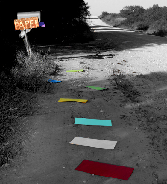
| The newspaper box looks very unnatural with this color. |
|
|
|
07/22/2007 10:49:56 PM |
| A fun use of desaturation. |
|
|
|
07/21/2007 10:29:05 PM |
| Love the shot, although I might have skipped the coloring of the mailbox. |
|
 Photographer found comment helpful. Photographer found comment helpful. |
|
|
07/20/2007 07:32:01 AM |
| The selective desat makes the colours of the paper look a bit ood. |
|
| Photographer found comment helpful. |
|
|
07/20/2007 12:05:28 AM |
| Interesting idea. I think it would benefit from some depth in the black and white areas. |
|
| Photographer found comment helpful. |
|
|
07/19/2007 03:45:39 AM |
| Nice idea, it seems thought that those are just folded paper and not letters |
|
| Photographer found comment helpful. |
|
|
07/18/2007 03:29:03 PM |
| Personally not too keen on selective saturation... |
|
|
|
07/18/2007 12:44:34 PM |
| Nice use of selective coloring. I think that the image lacks sharpness. |
|
| Photographer found comment helpful. |
|
|
07/18/2007 12:42:40 AM |
| lol, the paper's? i like the selective desat though. Im not sure who recieves random peices of colored paper in the mail, but you know what....i dont know much at all. |
|
| Photographer found comment helpful. |
Home -
Challenges -
Community -
League -
Photos -
Cameras -
Lenses -
Learn -
Help -
Terms of Use -
Privacy -
Top ^
DPChallenge, and website content and design, Copyright © 2001-2025 Challenging Technologies, LLC.
All digital photo copyrights belong to the photographers and may not be used without permission.
Current Server Time: 04/26/2025 06:34:12 AM EDT.