| Author | Thread |
|
|
02/02/2004 12:05:23 AM |
**critique club**
Hi,
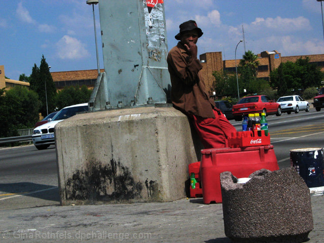
Okay, I'm going to go against the other commentors here and say that I think that the angle and the exposure actually make this photo a better one. Art is never meant to be pleasant: it's designed to make us think, make us uncomfortable, make us react to our environment more. Whether or not one believes that photography is art or not is a debateable point. In this case, you've introduced art into photojournalism. Well done.
The angle helps the meaning because it helps us feel a little of the unstability of the vendor. We're transported into his world, a world where the comforts of life are not taken for granted. The darkness in the face help, too, because there's a sense of anonymity, the feeling that the vendor is just another statistic.
However, just to counter the possibility that the exposure wasn't deliberate, and to find out how to appeal to DPC more, let me just add that you should expose for the face primarily. As the face is black, you need to compensate down a stop. If you find that the sky loses its colour, you'll need to use a polarising filter.
I find that the composition is a bit strange. I'd like for the vendor to be less centred because the cars behind the pillar on the left don't add anything to the scene, and there's a great possibility that there is valuable elements missed out on the right. Or zoom in more.
If you have any comments about my critique, please feel free to contact me.
Best wishes,
Jim
|
|
 Photographer found comment helpful. Photographer found comment helpful. |
Comments Made During the Challenge  |
|
|
01/25/2004 06:22:52 AM |
| I personally found the tilt disruptive and did nothing for the image. Would also have liked to have seen you move slightly to the right to get rid of what appears to be a broken concrete litter bin. I think the condition of the pole, pavement and seller would still have looked stark against the modern car/buildings roadway. I think about 1.5 shots extra exposure would have helped pull some facial detail out. |
|
| Photographer found comment helpful. |
|
|
01/22/2004 09:40:36 AM |
| A bit dark and off on horizontal lines to me. |
|
| Photographer found comment helpful. |
|
|
01/20/2004 08:35:59 AM |
| Liked to see a little sharper focus on the vender and maybe a tighter crop on the right. |
|
| Photographer found comment helpful. |
|
|
01/19/2004 05:29:14 PM |
| The way the photo is tilted is a little odd... |
|
| Photographer found comment helpful. |
|
|
01/19/2004 05:01:53 PM |
| I don't care for the tilted pov. I like the story you're starting to tell with this shot. THere's a lot of elements that don't add to the story (e.g. broken pillar in foreground, building, cars) that, if removed or blurred, would add to the main subject. Too bad his face is in shadows. |
|
| Photographer found comment helpful. |
|
|
01/19/2004 12:37:19 PM |
|
| Photographer found comment helpful. |
|
|
01/19/2004 04:11:38 AM |
| nice shot with some nice angles here. Think getting closer to him would have been better as the bg is quite cluttered. But a great shot still. |
|
| Photographer found comment helpful. |
Home -
Challenges -
Community -
League -
Photos -
Cameras -
Lenses -
Learn -
Help -
Terms of Use -
Privacy -
Top ^
DPChallenge, and website content and design, Copyright © 2001-2025 Challenging Technologies, LLC.
All digital photo copyrights belong to the photographers and may not be used without permission.
Current Server Time: 03/14/2025 11:21:55 PM EDT.