| Author | Thread |
|
|
04/02/2004 05:30:24 PM |
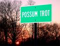
| Interesting viewpoint - not visible in thumbnail. |
|
Comments Made During the Challenge  |
|
|
01/26/2004 04:05:13 AM |
|
|
|
01/25/2004 08:54:13 AM |
| I wouldn't generally call this much of a road sign. The whole picture is a little dull. maybe boosting the contrast would've added a little more life. |
|
|
|
01/23/2004 07:37:25 PM |
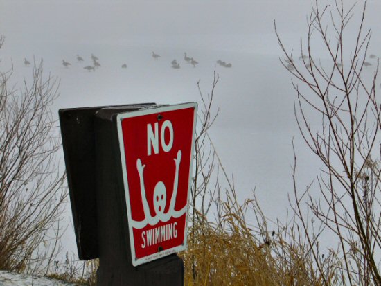
| It would help if the bakcground was in focus. I assume that its a frozen lake, but thats hard to see. |
|
 Photographer found comment helpful. Photographer found comment helpful. |
|
|
01/22/2004 08:30:10 PM |
| I like the foggy background. Front sign could have been a bit more in focus. Good job. |
|
| Photographer found comment helpful. |
|
|
01/22/2004 11:11:30 AM |
|
| Photographer found comment helpful. |
|
|
01/21/2004 11:25:00 AM |
| a little contrast adjustment needed, seems too gray to me. Good original sign! Im tired of STOP signs!! |
|
| Photographer found comment helpful. |
|
|
01/21/2004 09:02:29 AM |
| Depth of field could have been improved. |
|
| Photographer found comment helpful. |
|
|
01/21/2004 03:18:13 AM |
| ah, but what if you fell through? |
|
Home -
Challenges -
Community -
League -
Photos -
Cameras -
Lenses -
Learn -
Help -
Terms of Use -
Privacy -
Top ^
DPChallenge, and website content and design, Copyright © 2001-2025 Challenging Technologies, LLC.
All digital photo copyrights belong to the photographers and may not be used without permission.
Current Server Time: 04/27/2025 09:15:55 PM EDT.