Greetings from the critique club :)
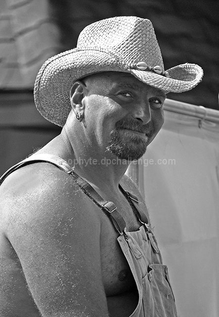
Well first of all, this definately meets the challenge, no doubt. I do like the lighting, maybe a bit harsh but still pretty good. I am not sure b/w was the way to go here, I do like the b/w conversion, it´s got great tones in it and looks cool but I just get this impression that the colors in this shot would have made it pop a bit more. Most of all, the hat and overall would have looked nicer in color I am sure, but the backround was maybe too prominent in color so that´s why you chose to make it b/w? Anyway, not sure it would be better, it´s just the impression I got.
Composition is not bad but maybe a bit too centered, had you taken this a bit wider and shown more of his surroundings, keeping him in the left corner of the photo, would it have been better? Maybe showing this dude in the dunk tank would have gotten you a better score, I am not sure. Anyway, this is a pretty nice photo and I think it should have scored a bit better but maybe the reason it didn´t is cause it´s not really memorable or stands out from the rest like it could have done had you maybe shown more of the surroundings.
Kind regards from Iceland, Lárus. |