| Author | Thread |
|
|
07/23/2007 01:15:35 PM |
| I think you did a great job, these shots tie in together perfectly. The shot on the bottom is my favorite, it looks like a beautiful place to go & run or hangout & the sky is georgeous! Don't worry, I can't follow most directions people try to give me in photoshop, I'm still learning too! |
|
 Photographer found comment helpful. Photographer found comment helpful. |
|
|
07/19/2007 03:44:47 PM |
| Nice on your first blue diptych. I will not say anything blue about your blue background being blue. The two pictures are quite nice, seriously. |
|
| Photographer found comment helpful. |
|
|
07/19/2007 09:24:34 AM |
| I'd say you have the ****tych (insert appropriate number) about 99.9% perfected. Like some of the others, I'm not crazy about that blue as a background, but that's a matter of personal choice. Nice choice of pictures for the inserts. |
|
| Photographer found comment helpful. |
|
|
07/19/2007 05:28:05 AM |
you're soooooo funny jon .. i'm sitting here laughing about your aircraft comment ... but i'm very willing to try and explain better ... as i said in the pm i didnt know your level of expertise, so it was difficult without that knowledge ... you tell me wot you didnt understand and i'll try and explain better ..
i know this probably isnt the place to say all this but i'm tired and wasnt even going to make any comments but saw this excellent combo, and your name, and just had to open it .. naturally after opening it i just had to comment .. its like a disease really eh? .. did you check out the thread you know you're spending too much time in dpc when ... .. its pretty funny ... the colours in this are just excellent and if this is your first attempt then the world is your oyster .. that is soooooo not the right expression, but as i said i'm tired .. but i'm sure you'd get the idea .. :) |
|
| Photographer found comment helpful. |
|
|
07/18/2007 10:33:29 PM |
| Great shots. the background is a bit distracting, but, like all things, you will get better with these the more you practice. You've definitely got a great start. |
|
| Photographer found comment helpful. |
|
|
07/18/2007 09:17:26 PM |
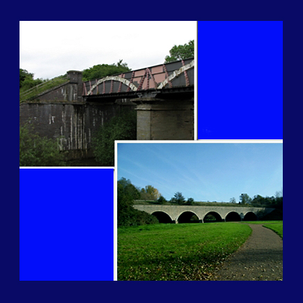
| Okay first this is a very nice diptych, maybe a bit over the top on the blue as it seems to distract a bit from the two wonderful images you have captured! The bottom shot is my fav. I love this, the pastoral scene with the very cool bridge is too cool! the curving path replicated in the archs of the bridge is just perfect! the upper shot has a more grity urban feel to it, don't ask me why it just does (for me). I like the white borders, in all very nice diptych. Desat...I'll pm you my method... |
|
| Photographer found comment helpful. |
|
|
07/18/2007 08:58:29 PM |
See now, if you ate more vegetables, you might have been able to comprehend those instructions better. *wink*wink*
But really - I admire your pioneering spirit here, Jon. The blue might be a bit misguided, but you did create a diptych and a good one at that. Love those Britishy photos you chose.
Now I'm going to have to get myself in gear and try some new stuff too! I mean, I can't let you learn things I can't do, afterall... :o) |
|
| Photographer found comment helpful. |
|
|
07/18/2007 07:59:09 PM |
This is really nice. I like the inner white frames - they look beveled maybe? I'm not a big fan of the bright blue on the inside but the outer blue is a great choice for the photo. I need to learn this too but have not made any initiative to do so lol.
I like your perspective on the bottom photo. Looks like an advertising piece.
Oh and nice greens too. I like the greens... |
|
| Photographer found comment helpful. |
|
|
07/18/2007 07:47:33 PM |
It's always better to try something (with a good or bad result), than doing nothing.
Personally I don't like the big border and the (too) blue fields, but I think the combination of the two photos is nice. The light in the upper photo looks very flat, but you can't always choose the weather. |
|
| Photographer found comment helpful. |
|
|
07/18/2007 07:36:42 PM |
| Actually... this isn't as "awful" as you assume it to be. (sheesh, just like a guy to need reassurance ;) ) AnyHOOOO!.... I like the blue being that the subjects are bridges... which always make me think of water. I think the borders are very nice. But these images looks so lovely... I think they could very well stand on their own. Wonderful composition... colors, clarity, very nice. |
|
| Photographer found comment helpful. |
Home -
Challenges -
Community -
League -
Photos -
Cameras -
Lenses -
Learn -
Help -
Terms of Use -
Privacy -
Top ^
DPChallenge, and website content and design, Copyright © 2001-2025 Challenging Technologies, LLC.
All digital photo copyrights belong to the photographers and may not be used without permission.
Current Server Time: 04/22/2025 07:53:57 PM EDT.