| Author | Thread |
|
|
02/29/2004 06:19:15 AM |
| Very nicely done! True photo marksman. Great work! |
|
|
|
01/28/2004 04:15:18 PM |
| i must say that i thought this was jbeguin as well. |
|
|
|
01/28/2004 08:25:15 AM |
Originally posted by pitsaman:
Is this JBeguin,nice 3-D contrast! |
Kosta this is EXACTLY what I thought too. Personally if someone mistaked me for JJB, I'd consider it quite the compliment |
|
 Photographer found comment helpful. Photographer found comment helpful. |
Comments Made During the Challenge  |
|
|
01/27/2004 10:44:11 PM |
| Fantastic.. nicely abstrat with wonderful detail and use of light 10 |
|
| Photographer found comment helpful. |
|
|
01/27/2004 09:18:59 PM |
| Is this JBeguin,nice 3-D contrast! |
|
| Photographer found comment helpful. |
|
|
01/27/2004 09:11:07 PM |
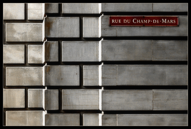
| Great shapes and pattern. Just very interesting image to look at. The sign stands out from the grey background. Good sharpness. Love the depth of it. Really well done. |
|
| Photographer found comment helpful. |
|
|
01/27/2004 05:03:23 PM |
| Interesting study in pattern and geometric shape. An appealing photo. Nicely done. |
|
| Photographer found comment helpful. |
|
|
01/27/2004 04:29:17 PM |
| Very interesting composition, lovely tones and texture, and a smart sign too. Very neat and hangable. If anything, it's a little wide of the brief as the sign isn't technically a road sign but it's seen from the road. But it doesn't really matter since I would much prefer to see a shot like this repetively than a shot that simply wins a challenge. [9] |
|
| Photographer found comment helpful. |
|
|
01/27/2004 01:05:19 PM |
| I really like how you achieved a soft look on the had bricks. Makes for a nice contrast and composition. Very nice lines here. |
|
| Photographer found comment helpful. |
|
|
01/27/2004 11:34:23 AM |
| This is beautiful. I really like the muted tones and crisp shapes. Simple, very nice! |
|
| Photographer found comment helpful. |
|
|
01/26/2004 10:16:06 PM |
| Montreal? I went there last week. Did'nt find the inspiration. Seems that you'd find it. Very well done. -9 |
|
| Photographer found comment helpful. |
|
|
01/26/2004 07:29:47 PM |
| Very very beautiful shot - your control of this exposure is so assured - the over-exposing of the lateral planes here gives an Escher-like optical illusion if one looks for too long - you lose the ability to see the true depth of the image in a confusion of different planes. Only slight draw-back is that it's more about the wall than the sign, but that's a minor point in such a good shot. 9 |
|
| Photographer found comment helpful. |
|
|
01/26/2004 03:22:32 AM |
|
|
|
01/25/2004 11:19:52 PM |
| I really like this for the design and simplicity. I like the way you framed it and kept it really straight. Nice job |
|
| Photographer found comment helpful. |
|
|
01/25/2004 05:28:35 AM |
|
| Photographer found comment helpful. |
|
|
01/25/2004 02:57:02 AM |
| Gorgeous graphic shot! Technically un-improveable, artistically delightful! This is eye candy! Magnéléphant! |
|
| Photographer found comment helpful. |
|
|
01/24/2004 10:56:48 PM |
| Great color and break up, I don't speak this language so I don't know what it means but it works. Good line alignment. |
|
| Photographer found comment helpful. |
|
|
01/24/2004 03:41:54 PM |
| I like the pattern of the wall. The only thing is that the edges are blown out on the left side of each wall. |
|
| Photographer found comment helpful. |
|
|
01/24/2004 03:24:47 PM |
| Hmmmm... Have you won a lot of ribbons? This just has that kind of feel. I know this feeling too, of something familiar even if you don't know what it is. Its classic. Great feel. I like the lines and shapes. Maybe I'm way off? 9 |
|
| Photographer found comment helpful. |
|
|
01/24/2004 12:57:24 PM |
| simple, yet extravagant... |
|
| Photographer found comment helpful. |
|
|
01/24/2004 11:58:19 AM |
| Plain colours. Plain subject. Plain image. I love it. I gave it a 10 for its courageous and striking simplicity. |
|
| Photographer found comment helpful. |
|
|
01/24/2004 08:25:26 AM |
| Superb Pictures, great levels and contrast ... ! |
|
| Photographer found comment helpful. |
|
|
01/23/2004 04:22:52 PM |
| great shot, composition, and simplicity. fine job. |
|
| Photographer found comment helpful. |
|
|
01/23/2004 04:34:37 AM |
| So simple, but impressive! Nice cut! |
|
| Photographer found comment helpful. |
|
|
01/22/2004 11:16:36 PM |
| An optical illusion. Good. |
|
| Photographer found comment helpful. |
|
|
01/22/2004 08:07:11 PM |
| You've captured very nice, bold contrasts. In my personal taste I like this, although I can see how it wouldn't be for everyone. Stick to your own judgment when it comes to what style works in your photos at any given time.. |
|
| Photographer found comment helpful. |
|
|
01/22/2004 01:53:44 PM |
| You made something very common beautiful. Excellent shot. |
|
| Photographer found comment helpful. |
|
|
01/22/2004 01:26:51 PM |
| Nice shapes going on here. And the little bit of red just stands out so well! 9 |
|
| Photographer found comment helpful. |
|
|
01/22/2004 11:12:52 AM |
| Very simple but composition is excellent, lines are straight. Great shot. |
|
| Photographer found comment helpful. |
|
|
01/22/2004 08:47:08 AM |
| Simple and effective. The only thing that i don´t like in this photo is the direction of the light - i think the elements that are receiving the lateral light are a little bit disturbing. |
|
| Photographer found comment helpful. |
|
|
01/22/2004 12:04:50 AM |
| Great composition. I also like the color contrast. |
|
| Photographer found comment helpful. |
|
|
01/21/2004 08:52:27 PM |
|
| Photographer found comment helpful. |
|
|
01/21/2004 04:09:32 PM |
| Excellent! Great composure |
|
| Photographer found comment helpful. |
|
|
01/21/2004 09:26:20 AM |
| spartan, yet dynamic composition. i love the color and texture of the bricks. you angled this just right for capturing the geometry of the pattern properly. nice work. |
|
| Photographer found comment helpful. |
|
|
01/21/2004 09:14:32 AM |
| Very nice. Great composition and contrast. Sets mood. |
|
| Photographer found comment helpful. |
|
|
01/21/2004 08:17:53 AM |
| I really love this photo.. this is excellent work. |
|
| Photographer found comment helpful. |
|
|
01/21/2004 06:18:53 AM |
| The texture on the stone almost makes it look like a drawing. |
|
| Photographer found comment helpful. |
|
|
01/21/2004 12:32:21 AM |
Very nice, I like the contrast, lighting and sharpness.
Even though in the US I wouldn't consider this to be a "Road Sign" |
|
| Photographer found comment helpful. |
Home -
Challenges -
Community -
League -
Photos -
Cameras -
Lenses -
Learn -
Help -
Terms of Use -
Privacy -
Top ^
DPChallenge, and website content and design, Copyright © 2001-2025 Challenging Technologies, LLC.
All digital photo copyrights belong to the photographers and may not be used without permission.
Current Server Time: 03/12/2025 07:48:55 AM EDT.