| Author | Thread |
Comments Made During the Challenge  |
|
|
09/22/2002 11:52:00 PM |
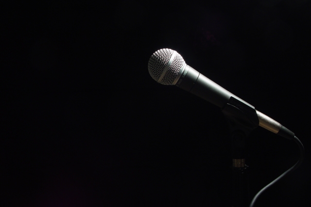
| very very nice. one of my favorites this time. perfect lighting! 10--amitchell |
|
|
|
09/22/2002 04:41:00 PM |
| Less is more - Perfect in every way, I would hang this on my wall - It gives me the strange feel of a tribute to a fallen performer. Good Luck, Gotcha - 10 |
|
|
|
09/22/2002 10:58:00 AM |
|
|
|
09/21/2002 05:44:00 PM |
| classic 57, nice lighting too |
|
|
|
09/21/2002 03:20:00 PM |
| Sometimes black and white just makes a statement that color could never make. Nice shot. |
|
|
|
09/21/2002 10:06:00 AM |
|
|
|
09/20/2002 08:54:00 PM |
| I love the dramatic lighting, the curve of the cord, and the absence implied by the negative space. |
|
|
|
09/20/2002 02:32:00 PM |
| Very nice use of neg space and good subject. I like this. Good luck in the challenge. Grayce aka Gracious |
|
|
|
09/20/2002 02:26:00 PM |
| While outstanding from a technical POV, I would have loved to see traces of the mike stand in this photo. Still, it is at least a 7, and therefore gets rounded to an 8. - mjcecil |
|
|
|
09/20/2002 12:35:00 PM |
This says "silence" to me - a stage or studio at rest, waiting for the singer to bring it alive. Nice lighting, composition nad shadows.
6, Kavey |
|
|
|
09/19/2002 01:04:00 PM |
Good example of simplicity winning out over complexity. It's just a microphone but with the the spot lighting there is a great sense of anticipation. Excellent touch leaving the left of the frame open and seeming to invite the performer to the microphone. My eyes and brain keep looking to the left expecting someone to walk in and start singing! Well done.
Score: 10
Courtenay |
|
|
|
09/19/2002 10:36:00 AM |
| Great...The lone mic begs the viewer ask 'where's the performer?'.... |
|
|
|
09/19/2002 10:33:00 AM |
| Great use of negative space...love the simplicity of this. 9 Lisa |
|
|
|
09/19/2002 09:07:00 AM |
| Sometimes art is what the viewer brings to it, which may or may not coincide with the artist's intention. To me, this picture could be cover art for the movie "Lenny," a biopic about the late Lenny Bruce, seminal standup comedian "who broke boundaries of language and subject matter by questioning hypocrisy and telling it hilariously like he saw it" (Amazon summary). His story is comedy with a tragic lining, as it ended in a morphine overdose. Much of his career was a joyous but frenzied rebellion against censorship. For these two reasons, the abandoned microphone represents (to me) a poignant homage. Since our culture reads left-to-right, the microphone�s placement invites the eye and emphasizes the negative space to its left -- a void aching for a voice. This photo both meets the challenge and moves me emotionally. 10 |
|
|
|
09/18/2002 08:14:00 PM |
| Nice use of negative space. I like it. 8 |
|
|
|
09/18/2002 03:35:00 PM |
| Very nice work. Enough light on the mike to show details but not so much tha there is a lot of reflection. karmat |
|
|
|
09/18/2002 07:54:00 AM |
| Great shot. Could perhaps have used a tny bit more light. 9 - floyd |
|
|
|
09/18/2002 01:22:00 AM |
Composition: I like your composition and lighting if I was nitpicking I would say that it has to much empy space on the left but you would have to be careful as if it moved to much to the centre it would lose its impact 8
Lighting: 6,
Appeal7 Total Rating 8 Sulamk
|
|
|
|
09/17/2002 10:36:00 PM |
| As a former Roadie this one speaks to me, "After the show Silance" very eye catching. |
|
|
|
09/17/2002 04:06:00 PM |
| A very good way to catch the silence on a photo. |
|
|
|
09/17/2002 03:23:00 PM |
| I really like this. The lighting is perfect. |
|
|
|
09/17/2002 03:11:00 PM |
| This is one of my definite favorites this week... I have no critique... i like it :) = 10 - jmsetzler |
|
|
|
09/17/2002 04:49:00 AM |
| Really cool shot, great artistic merit... (10) |
|
|
|
09/17/2002 12:13:00 AM |
|
|
|
09/16/2002 09:00:00 PM |
|
|
|
09/16/2002 07:36:00 PM |
| very cool use of - space :) |
|
|
|
09/16/2002 06:00:00 PM |
| A lot of mood here for a simple image. Are we waiting for the singer? nice lighting. |
|
|
|
09/16/2002 02:55:00 PM |
| My favorite picture ...very strong |
|
|
|
09/16/2002 10:57:00 AM |
| Fantastic. Nice light. Score 8 Justine |
|
|
|
09/16/2002 10:26:00 AM |
| Lots of negative space in many photos... but this is the only one where the space makes sense, it means something, it contextualizes the subject and the picture would mean something else without the space. Excellent conception, well executed. |
|
|
|
09/16/2002 04:01:00 AM |
| nice focus.. i like this alot. |
|
Home -
Challenges -
Community -
League -
Photos -
Cameras -
Lenses -
Learn -
Help -
Terms of Use -
Privacy -
Top ^
DPChallenge, and website content and design, Copyright © 2001-2025 Challenging Technologies, LLC.
All digital photo copyrights belong to the photographers and may not be used without permission.
Current Server Time: 03/12/2025 02:35:49 AM EDT.