| Author | Thread |
|
|
08/08/2007 05:05:16 PM |
Greetings from the Critique Club!
Just my luck...my 13th critique of the day and I draw a high-scoring, well-placed image from a two-time blue ribbon winner! Well, it's no holds barred, baby! ;)
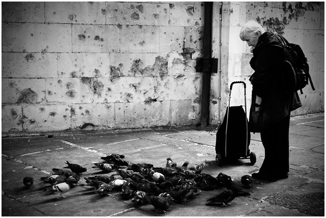
First impression: An interesting image that makes me pause to consider the relationship of the woman to the pigeons. She's standing there passively looking at the birds on the pavement. The pavement is old and worn. The wall looks like it's been shot at by a machine gun...or just pitted by weather and neglect. Where is she?
Because the birds are contentedly milling about one can gather that they've been fed. But, to me, she doesn't seem much like a "pigeon lady"...there is a lack of interaction between her and the birds. Her posture is so disengaged with the "event" that one could think she'd just wandered out from the local train station on her way to somewhere and has paused to contemplate the urban birds. She doesn't seem particularly homeless or street bound to me...
Technically this is a fairly competent image. I like the choice of B&W but wonder if it was actually necessary...even sepia (or some other toning) could have injected some life, some drama(?) into this image. I agree with the commentators who point out the blocked blacks...I don't think the lack of detail in those areas really adds to the image. The vignetting is obvious and, though probably needed to contain the image within the frame, feels a bit over-done.
Overall, it's a good image. Had I voted in the challenge I likely would have given it a 6 (as many other voters did) because it is a clean image...there's just nothing else to raise it above average for me. More emotion! More engagement! More story or "reason to be"!
(Sorry if it seems that I'm being unduly harsh but I'd rather call it like I see it and take on argument than give you some kind of smiling nod of approval.) |
|
 Photographer found comment helpful. Photographer found comment helpful. |
Comments Made During the Challenge  |
|
|
08/05/2007 10:18:32 PM |
| Black & White works really good here, well done. |
|
| Photographer found comment helpful. |
|
|
08/05/2007 12:16:56 AM |
| vignetting is a little too obvious for me. I don't know why this needs vignetting. |
|
| Photographer found comment helpful. |
|
|
08/02/2007 02:07:56 PM |
| The vinetting is cool just open up the shadow detail of the ladies jacket and Whamo you got a printer |
|
| Photographer found comment helpful. |
|
|
08/02/2007 11:49:14 AM |
| I like the diagonal on the wall formed by the decaying concrete. Nice contrast in this, too. |
|
| Photographer found comment helpful. |
|
|
07/31/2007 06:39:17 PM |
| it has good tones and definitely street, but nothing to really grab me. I like the blurred birds though. 6 |
|
| Photographer found comment helpful. |
|
|
07/31/2007 08:45:30 AM |
|
| Photographer found comment helpful. |
|
|
07/31/2007 03:55:38 AM |
| Nice capture - Like the tones and subject |
|
| Photographer found comment helpful. |
|
|
07/30/2007 06:30:45 PM |
| My only suggestion is more detail in the shadows. I like the compostion and the story you've captured. |
|
| Photographer found comment helpful. |
|
|
07/30/2007 05:04:37 PM |
|
| Photographer found comment helpful. |
|
|
07/30/2007 04:59:50 AM |
a nice simple shot.
somebody been shooting pigeons? |
|
| Photographer found comment helpful. |
|
|
07/30/2007 03:35:59 AM |
|
| Photographer found comment helpful. |
Home -
Challenges -
Community -
League -
Photos -
Cameras -
Lenses -
Learn -
Help -
Terms of Use -
Privacy -
Top ^
DPChallenge, and website content and design, Copyright © 2001-2025 Challenging Technologies, LLC.
All digital photo copyrights belong to the photographers and may not be used without permission.
Current Server Time: 03/11/2025 12:40:41 PM EDT.