| Author | Thread |
|
|
09/19/2008 01:46:57 PM |
i love the color and the lighting.
good picture overall.
9 out of 10 |
|
Comments Made During the Challenge  |
|
|
09/21/2002 11:28:00 PM |
| Excellent colors, focus and lighting. karmat |
|
|
|
09/20/2002 02:30:00 PM |
| doesn't emphasize theme, medium good composition |
|
|
|
09/19/2002 01:48:00 PM |
|
|
|
09/19/2002 04:09:00 AM |
|
|
|
09/18/2002 07:05:00 PM |
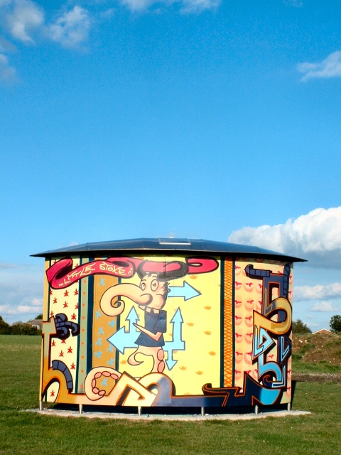
| Wow, that is an awesome painting. I don't like the glare right in the middle. Some of these people that go out and do this are really talented. 7 |
|
|
|
09/18/2002 12:26:00 PM |
| I may be missing something, but I don't really see what the neg space adds to this photo. Also, it is not level. |
|
|
|
09/16/2002 11:17:00 AM |
| i like the gazebo--nice color--might be tiltled just a little--7bobgaither |
|
|
|
09/16/2002 10:44:00 AM |
| Good colors and clear shot. Maybe too centered and could be more cropped at the bottom. Score 6 Justine |
|
|
|
09/16/2002 08:57:00 AM |
| I see the negative space. Ideally there would be no clouds but it's fine the way it is |
|
|
|
09/16/2002 02:17:00 AM |
Composition: I dont think this represents negative space 4
Lighting: good4 ,
Appeal: 5, Total Rating 4 Sulamk |
|
Home -
Challenges -
Community -
League -
Photos -
Cameras -
Lenses -
Learn -
Help -
Terms of Use -
Privacy -
Top ^
DPChallenge, and website content and design, Copyright © 2001-2025 Challenging Technologies, LLC.
All digital photo copyrights belong to the photographers and may not be used without permission.
Current Server Time: 03/12/2025 08:34:32 PM EDT.