| Author | Thread |
|
|
02/09/2004 06:19:12 PM |
From critique club.
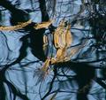
This image looked like a disappointment to me, I gave it just 3 :-(((
Having read the author's comment I realize that this shot is a technical curiosity rather than just a crab and would probably give it more credits after all. But still, I have a problem with the composition (why crab is cropped? I don't argue with the off-center displacement!) and the idea (what does this all mean?). Technically, I would experiment with some colored lighs and made more of the vase texture visible around. |
|
Comments Made During the Challenge  |
|
|
02/03/2004 02:16:45 AM |
|
|
|
01/30/2004 06:41:43 AM |
| An image that goes extremely well with Cancer. Good job! |
|
 Photographer found comment helpful. Photographer found comment helpful. |
|
|
01/29/2004 07:33:32 PM |
| I like this photo, but not really too sure about it....the hue is kinda strange, but it is interesting enough to catch my eye |
|
| Photographer found comment helpful. |
|
|
01/29/2004 04:49:20 PM |
Nice enough image but don't like the inversion.
EDIT: I understand from our PMs that this isn't an inversion but a glass paperweight! Thanks for letting me know. Visually it looks like a negative - I guess that's what I don't like. What I do like is the texture around the edge. |
|
| Photographer found comment helpful. |
Home -
Challenges -
Community -
League -
Photos -
Cameras -
Lenses -
Learn -
Help -
Terms of Use -
Privacy -
Top ^
DPChallenge, and website content and design, Copyright © 2001-2025 Challenging Technologies, LLC.
All digital photo copyrights belong to the photographers and may not be used without permission.
Current Server Time: 03/12/2025 07:25:45 PM EDT.