| Author | Thread |
|
|
02/05/2004 07:11:26 PM |
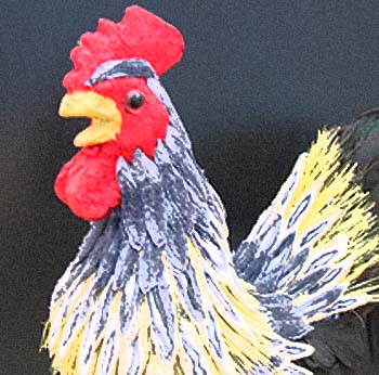
This is rooster. So? Anything that makes it special? I am trying to find something to justify the composition and acieved effect. How about this idea: even more blurred subject and some meaningful symbolic background in focus?
The A60 is a very nice camera - I know a guy who beeing an amateur published a whole album of pro-quality shots. |
|
Comments Made During the Challenge  |
|
|
01/29/2004 11:43:41 PM |
| The quality isnt really the best and the background has a little noise in it. Composition is fine, but the subject is also slightly blurry. It could be your camera, else you should try and use a lot of light for the camera to focus better and also use a tripod or a sturdy surface to rest the camera on if you are not. |
|
|
|
01/29/2004 10:29:32 PM |
| This looks more like a drawing fits the cahallenge but not too good focus or image |
|
 Photographer found comment helpful. Photographer found comment helpful. |
|
|
01/29/2004 05:28:19 PM |
| A little blown out by the lighting and slightly out of focus. |
|
| Photographer found comment helpful. |
|
|
01/27/2004 03:44:16 PM |
|
| Photographer found comment helpful. |
|
|
01/27/2004 03:23:09 PM |
| The grain and blurr are distracing to me. Interesting rooster. |
|
| Photographer found comment helpful. |
|
|
01/26/2004 11:01:55 AM |
| The vivid colours are great but there is something that does not work at all for me. I think that as this could very definately be considered "art" rather than a photograph I think it is going to be either an "I love it" or I hate it. I find the texture of the background disturbing. If it had been solid black I think that would help (for me). HOWEVER - The picture has intrigued me enough for me to want to look at more of your pictures - and so in that case it has worked! Apologies for the lower mark on this one but I am glad I want to look at more of your work |
|
| Photographer found comment helpful. |
|
|
01/26/2004 02:03:34 AM |
| Nice compostion, wierd effect. |
|
| Photographer found comment helpful. |
|
|
01/26/2004 12:00:59 AM |
| Seems just a little too grainy and a bit washed out. I think if the colors were more vibrant and the focus not so soft this would've been a little better. Good subject though. |
|
| Photographer found comment helpful. |
|
|
01/25/2004 10:29:58 AM |
| I'm sorry thats just not real good resolution :( |
|
| Photographer found comment helpful. |
|
|
01/25/2004 12:54:27 AM |
| the effect that you used is highly distracting |
|
| Photographer found comment helpful. |
Home -
Challenges -
Community -
League -
Photos -
Cameras -
Lenses -
Learn -
Help -
Terms of Use -
Privacy -
Top ^
DPChallenge, and website content and design, Copyright © 2001-2025 Challenging Technologies, LLC.
All digital photo copyrights belong to the photographers and may not be used without permission.
Current Server Time: 03/12/2025 11:01:31 PM EDT.