| Author | Thread |
|
|
02/02/2004 12:19:49 AM |
| Great photo Robin. Great finish. The colours make this really pop out of the black background. Nicely done. |
|
 Photographer found comment helpful. Photographer found comment helpful. |
Comments Made During the Challenge  |
|
|
02/01/2004 06:14:06 PM |
| This is No.1 for me. Brilliantly captured. Well done. 10 |
|
| Photographer found comment helpful. |
|
|
01/31/2004 03:53:06 PM |
|
| Photographer found comment helpful. |
|
|
01/30/2004 08:47:47 AM |
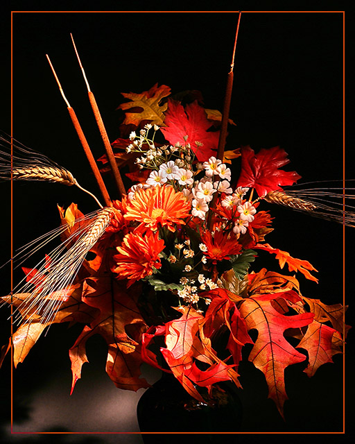
| Red border does add interest for me, lighting works well. |
|
| Photographer found comment helpful. |
|
|
01/29/2004 05:43:23 PM |
Is it fall already?? Did I miss summer?? ;)
Dood picture, good use of light. I am not a big fan of fantasy borders but yours look good!
|
|
| Photographer found comment helpful. |
|
|
01/29/2004 01:50:49 PM |
| wonderful arrangement. The colors are terrific! |
|
| Photographer found comment helpful. |
|
|
01/29/2004 01:33:20 PM |
| I see that this photo had to be validated........why? Because of the fall color leaves? Anyway, I love the "fall" colors and your choice of border. I still haven't figured out how to make a border like. I don't suppose you can give me some tips? |
|
| Photographer found comment helpful. |
|
|
01/29/2004 07:13:19 AM |
| Simply beautiful. Wonderful framing, colors, textures and lighting ! |
|
| Photographer found comment helpful. |
|
|
01/28/2004 09:34:41 AM |
| Beautiful...Colors and contrasts. |
|
| Photographer found comment helpful. |
|
|
01/28/2004 05:00:35 AM |
I like it - I don't - I like it - I don't -I like it - I dont - Then I realise I do!
I have had such a job deciding whether I like this or not. Unfortunatly I cannot decide why I do and can't see why I didn't which is not constructive at all and for that I apologise.
If I had to pick a thing that I had a problem with is that quite a few areas seem to have burned out and they may be catching my eye too much.
The rush on the right for example, looks good but the too on the left have a tad too much illumination.
I am intrigued as to why the picture had to be validated.
I have just noticed why I couldn't make up my mind. There could (in my opinion) be a "point of focus". Something that the eye is led towards. All the "lines seem to be leading to a point near the centre of the picture bnut there is no" focus object" apparent there.
I have whipped this into photoshop and made that centre flower a vivid horrible green to see what happened and it lifted the picture out and gave those lines purpose.
I am not suggesting that the flower should have been a vivid horrible green :-) just that that is where either a considerably bigger flower head or a very different head could have been.
David
|
|
| Photographer found comment helpful. |
|
|
01/27/2004 04:05:59 PM |
| One of my favorites of the challenge. After the negative comments about borders in the past week or so, I'm glad to see that you went ahead and used one here. It's a perfect fit to this shot and makes it feel very worthy of framing and hanging. I can't give you a vote, but if I could, it would surely be a 10 |
|
| Photographer found comment helpful. |
|
|
01/26/2004 04:51:16 PM |
| The light on the table is a bit distracting, as well as the angle of the vase (looks tilted), but overall I like your idea. Nice job. |
|
| Photographer found comment helpful. |
|
|
01/26/2004 02:53:18 AM |
| Sensational. I love how sharp you got the colours here. |
|
| Photographer found comment helpful. |
Home -
Challenges -
Community -
League -
Photos -
Cameras -
Lenses -
Learn -
Help -
Terms of Use -
Privacy -
Top ^
DPChallenge, and website content and design, Copyright © 2001-2025 Challenging Technologies, LLC.
All digital photo copyrights belong to the photographers and may not be used without permission.
Current Server Time: 03/12/2025 07:37:10 PM EDT.