| Author | Thread |
|
|
02/04/2004 11:03:58 PM |
Greetings from the Critique Club!
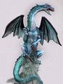
This is a lovely shot that met the challenge and then some! I love the dragon in this shot and the blue tint that runs throught the statue is very unique. But the lighting leaves me wanting more. Maybe if you could have come in from the sides and top to really help highlight those blue tints.
The black background is perfect but the cloth underneath the dragon is distracting to me. I think you were going for the oriental feel with the pattern but I think the dragon would have done that better by himself.
The cropping and composition are great. Overall a very nice shot.
Good Luck In Future Challenges!
Deannda
DNeufer@stny.rr.com if you have any questions or want to discuss this further! |
|
 Photographer found comment helpful. Photographer found comment helpful. |
Comments Made During the Challenge  |
|
|
01/29/2004 10:58:02 PM |
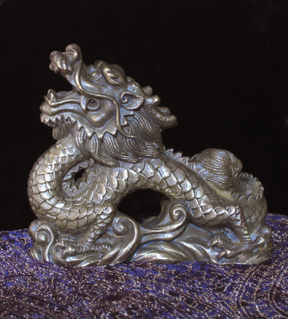
very nice! I am not sure I like the base but good detail and focus
Fits the challenge well |
|
| Photographer found comment helpful. |
|
|
01/29/2004 08:27:00 PM |
Looks a little flat. Some more creative lighting (I would try from the left side) would help bring out the wonderfull textures and detail.
TC |
|
| Photographer found comment helpful. |
|
|
01/28/2004 05:49:58 PM |
|
| Photographer found comment helpful. |
|
|
01/26/2004 01:43:17 AM |
| Nicely shot and laid out. |
|
| Photographer found comment helpful. |
|
|
01/25/2004 09:05:45 PM |
| Its good to see a well done product shot. |
|
| Photographer found comment helpful. |
Home -
Challenges -
Community -
League -
Photos -
Cameras -
Lenses -
Learn -
Help -
Terms of Use -
Privacy -
Top ^
DPChallenge, and website content and design, Copyright © 2001-2025 Challenging Technologies, LLC.
All digital photo copyrights belong to the photographers and may not be used without permission.
Current Server Time: 03/12/2025 02:51:57 PM EDT.