| Author | Thread |
|
|
08/24/2007 10:37:49 AM |
Greetings from the Critique Club
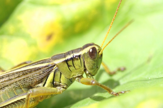
Macros of insects are fun to look at and a challenge to make well. What I like most about macros is the way they give me leisure to study the details of small creatures. I like the textures in their bodies and wings. So, to me, it's important that those details are crisp and the whole image is enjoyable to view for a period of time.
Here I have to agree with comments about the overexposure. A quick look at this image's histogram proves the point. Enhancing the darker tones would help to bring out the details.
I also find this a little too yellow. It may be that the leaf was close to that color but it's just not appealing. A little desaturation on the green and yellow hues would make this easier to spend time with. It would help enhance the reddish tones present in the grasshopper's eyes and wings.
The composition is okay. I'd prefer to see a bit more of the hopper's body but that's just my personal preference. In general I like the subject's placement within the frame.
The factor I think holds this image back the most, however, is the lack of focus on the eye. Perhaps that could be fixed in post-process...but I doubt it. It's really important to get the eyes of animals and humans tack sharp when shooting. It's just human nature to look at the eyes first and repeatedly as the viewer explores the image.
Overall, I think it's a nice grab shot. It's hard to impress DPC viewers with anything less than a near-perfect bug shot since there have been so many in challenges on the site. That may be true with other subjects as well...we're always looking for a little extra to surprise us.
Congratulations on making it through your first challenge without too many scars.
Keep shooting! |
|
Comments Made During the Challenge  |
|
|
08/19/2007 08:01:51 PM |
| Nice colors. Need better focus and the dodging of the highlights made things look a bit too yellow, especially around the eye. |
|
|
|
08/14/2007 09:50:13 AM |
|
|
|
08/13/2007 03:46:27 PM |
| Nice Marco.... a little blown out. This could be toned down with more contrast. |
|
|
|
08/13/2007 05:07:14 AM |
|
Home -
Challenges -
Community -
League -
Photos -
Cameras -
Lenses -
Learn -
Help -
Terms of Use -
Privacy -
Top ^
DPChallenge, and website content and design, Copyright © 2001-2025 Challenging Technologies, LLC.
All digital photo copyrights belong to the photographers and may not be used without permission.
Current Server Time: 03/14/2025 09:26:39 AM EDT.