| Author | Thread |
Comments Made During the Challenge  |
|
|
08/18/2007 12:45:19 PM |
|
 Photographer found comment helpful. Photographer found comment helpful. |
|
|
08/18/2007 12:28:40 PM |
|
| Photographer found comment helpful. |
|
|
08/17/2007 12:53:15 AM |
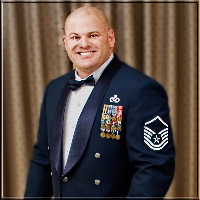
| Nice portrait. I like how the background resembles the colors of some of the medals on the jacket. The print that is in focus around the head is a bit distracting, maybe a bit of blurring in that area could reduce the clarity of the print. |
|
| Photographer found comment helpful. |
|
|
08/15/2007 05:36:50 PM |
|
| Photographer found comment helpful. |
|
|
08/15/2007 04:58:03 PM |
| Very poor background blur. Obviously done in post. |
|
| Photographer found comment helpful. |
|
|
08/14/2007 11:16:50 PM |
You can probably attribute some of your low votes after this morning to the fact that you thrashed voters while having an entry that's pretty easily connected back to you. But since you asked, here are some comments:
Lighting is okay...not bad but not particularly interesting either. Just pretty even overall which is fine but doesn't lend much feeling to the shot. Your post-processing kills the shot. If your intention was to make it look like you shot with a shallower depth of field, you failed because it looks unnatural and you did a sloppy job around the head and overblurred the edges of the jacket. Better to move the subject farther away from the backdrop if you're wanting it more blurred or if it's distracting. Had there been a shallower DOF here ,I think the pattern on the curtain(?) would have been okay but the wrinkles are still a little distracting.
If your intention was to emulate some kind of glamor portrait, then I'd say bad choice for a military shot.
The head is a little close to the top for my taste, it makes the frame feel a little crowded. Smile seems a little forced. Overall, I think you have a good opportunity to make some powerful and dignified self-portraits in uniform but this shot feels a little more like an assembly-line shot done at the end of a reception room. American Photo had a shot on the cover a few months ago that stuck with me. Perhaps if you work on some more dynamic lighting...in any case, I hope some of this helps in some way.
-brave shit mk |
|
| Photographer found comment helpful. |
|
|
08/14/2007 04:51:52 PM |
| Yeah he is bursting with pride isnt he. Appreciate what he is doing for us. My son is in airborne school this week. psart 8 |
|
| Photographer found comment helpful. |
|
|
08/13/2007 04:43:55 PM |
| Great portrait, very sharp focus. |
|
| Photographer found comment helpful. |
|
|
08/13/2007 02:48:02 PM |
| The selective sharpening (or selective blur, can't quite tell which) has left some very distracting sharpness in the patterned backdrop around his head. I believe if you perform your selection with the image zoomed at 100% or greater you might be able to get a more accurate edge with your selection. This is a nice idea though, for portrait presentation, and is still a cut above average. |
|
| Photographer found comment helpful. |
|
|
08/13/2007 12:38:39 PM |
| Pay attention to details. His bowtie should have been straightened. |
|
| Photographer found comment helpful. |
|
|
08/13/2007 12:25:56 PM |
| The background in your photo distracts from your main subject. A darker material or a shallower DOF may have helps. |
|
| Photographer found comment helpful. |
|
|
08/13/2007 09:29:16 AM |
|
| Photographer found comment helpful. |
|
|
08/13/2007 09:01:51 AM |
| umm..ok nice portrait? =) |
|
| Photographer found comment helpful. |
Home -
Challenges -
Community -
League -
Photos -
Cameras -
Lenses -
Learn -
Help -
Terms of Use -
Privacy -
Top ^
DPChallenge, and website content and design, Copyright © 2001-2025 Challenging Technologies, LLC.
All digital photo copyrights belong to the photographers and may not be used without permission.
Current Server Time: 03/18/2025 04:58:10 AM EDT.