| Author | Thread |
|
|
02/09/2004 05:54:18 AM |
Responding to your request for comments in the forums:
Actually I'm not going to be so helpful as I would have scored this a 6 or 7.
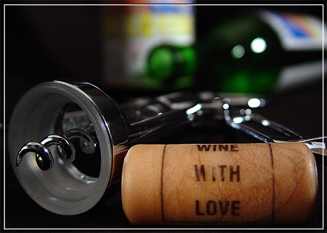
I like the feel of perspective that you have achieved by going close in to the subjects in the foreground and also by using a low viewpoint. I also really like the low DOF that has resulted.
Another thing I like is the inclusion of the cork text - adds an interesting detail.
I would say that the overall image is quite dark - not badly lit, just in terms of choices of backdrop and subject matter - which may not appeal to a lot of voters.
I'd also add that composition isn't particularly strong or balanced - there is an interesting diagonal from the corkscrew and top right bottle but otherwise the composition feels very random, and doesn't click for me.
|
|
 Photographer found comment helpful. Photographer found comment helpful. |
Comments Made During the Challenge  |
|
|
02/07/2004 05:18:33 PM |
| Very well composed with some nice colour in the back. Great use of DOF too. Good luck. |
|
| Photographer found comment helpful. |
|
|
02/06/2004 04:12:37 AM |
| very professional and great focus It may be a winner |
|
| Photographer found comment helpful. |
|
|
02/04/2004 06:13:17 PM |
| Nice compostion, but I find the colours of the labels distracting. Under advanced rules you could desaturate them without affecting the rest of the picture. Others may disagree - just a thought. |
|
| Photographer found comment helpful. |
|
|
02/04/2004 10:54:59 AM |
| beautiful close up photo, love the shallow dof and the bokeh effect. nice work. |
|
| Photographer found comment helpful. |
|
|
02/03/2004 11:59:34 AM |
| Composition could be better, the cork and corkscrew are too much in the bottom of the picture, too close to the edge. The colored labels on the labels are a bit distracting. Depth of focus is very nice, good lighting. |
|
| Photographer found comment helpful. |
|
|
02/02/2004 07:30:23 PM |
| Yup, this meets the challenge. And a beautiful rendition of the corkscrew and cork. Wonder what brand makes that appropriately named cork. Doesn't matter, nicely done. |
|
| Photographer found comment helpful. |
|
|
02/02/2004 11:49:00 AM |
Great DOF but litle to much cropping ... let the things breath more.
Lightning good.
I would say that this is a 9 hmmm or not ... maybe just 10 :) |
|
| Photographer found comment helpful. |
|
|
02/02/2004 06:48:51 AM |
The shallow DOF is really effective.
Good image |
|
| Photographer found comment helpful. |
|
|
02/02/2004 02:17:05 AM |
| Interesting, love the lack of depth. |
|
| Photographer found comment helpful. |
|
|
02/02/2004 01:52:58 AM |
|
| Photographer found comment helpful. |
Home -
Challenges -
Community -
League -
Photos -
Cameras -
Lenses -
Learn -
Help -
Terms of Use -
Privacy -
Top ^
DPChallenge, and website content and design, Copyright © 2001-2025 Challenging Technologies, LLC.
All digital photo copyrights belong to the photographers and may not be used without permission.
Current Server Time: 03/14/2025 11:45:06 AM EDT.