| Author | Thread |
Comments Made During the Challenge  |
|
|
08/25/2007 05:57:47 PM |
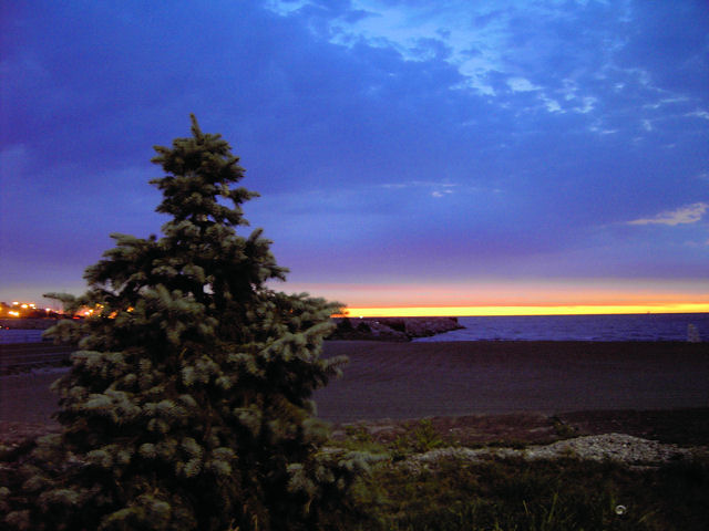
| I like the fact that you have included a foreground object for interest, but it looks kinda creapy to me :) For some reason on my monitor the red horizon just doesn't look right...also the mixture of warm tones at the horizon and cool tones in the clouds is awkward. he lights behind the tree are a little distracting and the can? on the front right too. I guess overall the distractions don't fit solitude for me, but remember that is just one person's opinion here and doesn't mean the photo is bad. I'm sure there are just as many folks that love it.... |
|
 Photographer found comment helpful. Photographer found comment helpful. |
|
|
08/24/2007 08:39:36 PM |
| The foreground being in better focus would add to this shot. |
|
| Photographer found comment helpful. |
|
|
08/24/2007 12:11:55 PM |
| nice lighting in the background. In my opinion the tree is a bit distracting and doesn't really provide a good enough sense of scale to make a solitude impact. |
|
| Photographer found comment helpful. |
|
|
08/22/2007 07:59:52 PM |
| The lights to the left of the image are distracting, I would suggest cropping. |
|
| Photographer found comment helpful. |
Home -
Challenges -
Community -
League -
Photos -
Cameras -
Lenses -
Learn -
Help -
Terms of Use -
Privacy -
Top ^
DPChallenge, and website content and design, Copyright © 2001-2025 Challenging Technologies, LLC.
All digital photo copyrights belong to the photographers and may not be used without permission.
Current Server Time: 03/10/2025 10:11:13 PM EDT.