| Author | Thread |
|
|
02/09/2004 12:35:53 AM |
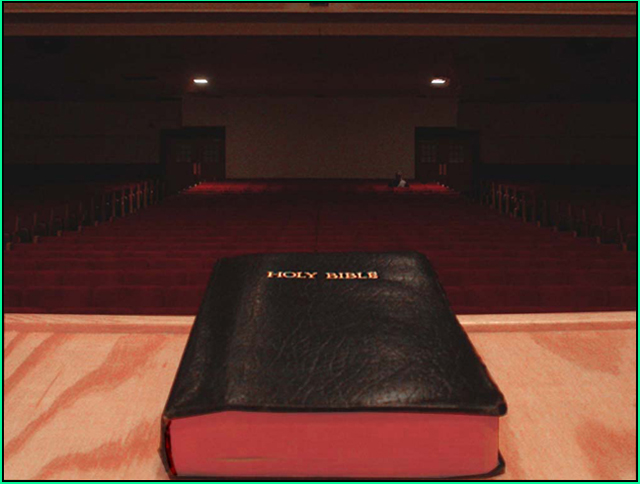
Oh I see, there are seats in the foreground! Dam (oh well, drat, darn, doh!)... to dull to see the first time I looked, I had to read a comment befor I noticed them.
Message edited by author 2004-02-09 22:18:32. |
|
Comments Made During the Challenge  |
|
|
02/06/2004 05:05:55 PM |
| Nice composition. The shot is a bit overbright in front, and dark and grainy in the rear, though; I almost missed the man in the back pew, and he adds quite a bit of emotional interest to the shot. Good try! |
|
|
|
02/05/2004 11:22:22 AM |
| compositionaly okay, technically bad. Turn down the lighting inthe foreground a bit, turn it up in the background and sharpen the focus. are you preaching to us or making a work of art? |
|
|
|
02/05/2004 07:36:32 AM |
| Agree with your title BUT can't see the connection to the topic. Sorry |
|
|
|
02/03/2004 08:56:42 AM |
| The Green Border is a very bad choice. |
|
|
|
02/03/2004 06:25:01 AM |
| Nice rendering of the wood texture. The red light along the edge of the Bible's pages is disturbing because this would normally be white, and the green border clashes with the colors in the photo. |
|
|
|
02/03/2004 03:52:54 AM |
| Not sure what goes together here! Underexposed except for the bible. |
|
|
|
02/02/2004 12:38:42 AM |
|
|
|
02/02/2004 12:27:47 AM |
| Maybe if you had propped the bible up a bit or taken the shot from above this would of had more snap. The camera is about on the same plane as the bible. Sorry. |
|
Home -
Challenges -
Community -
League -
Photos -
Cameras -
Lenses -
Learn -
Help -
Terms of Use -
Privacy -
Top ^
DPChallenge, and website content and design, Copyright © 2001-2025 Challenging Technologies, LLC.
All digital photo copyrights belong to the photographers and may not be used without permission.
Current Server Time: 03/12/2025 07:52:49 PM EDT.